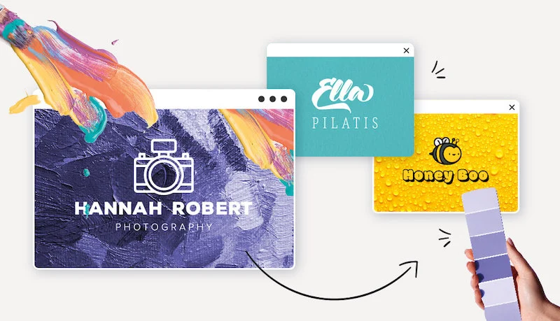
When you’re designing a logo , one of the most important decisions is choosing the colors for your brand. Choosing the right color palette helps to better establish your identity and add versatility to your design.
The color choices also give depth to your logo by making a visual connection with your company’s values and personality. The right combination can visually convey the feeling your company is making towards consumers.
More than just aesthetic appeal, color helps your brand connect with consumers on a deeper psychological level. When you choose your brand’s logo and color scheme, you’re also choosing the emotions and associations you’re trying to evoke.
This color psychology is an important consideration as you build your brand identity. The right color palette can convey a deep sense of your values and elicit specific behaviors. Broadly speaking, the wrong choices can harm your brand image.
Science has repeatedly shown that our brains respond in different ways to specific colors. By understanding how each color affects the mind and the emotions it stirs up, you can create a more effective brand. It’s important to remember that this is a nuanced and complex field that requires careful thought. Consider how each of these colors affects emotionally and psychologically:
Red
One of the primary colors and a common symbol of passion, anger, and excitement, red is a popular color in branding. If you are looking for a youthful, playful and vibrant brand image, then red is an ideal choice. If you prefer a softer, cautious approach, then red shouldn’t appear on your color radar.
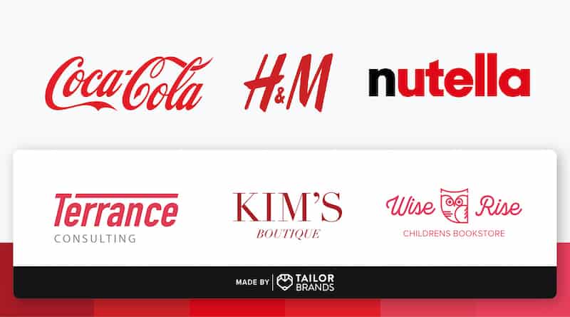
Popular psychology for the color red include:
- Tender
- Energy
- Romantic
- Warmth
- Love and cherish
- Appease
>>> Read more about the red logo
Yellow
This warm color is a good example of friendliness and cheerfulness. Brands looking to attract consumers with a warm, comforting embrace and youthful energy should look to Yellow. In addition, color can radiate a playful and affordable identity.
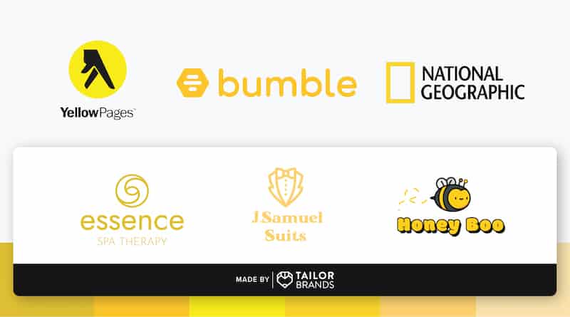
Popular psychology for the color yellow include:
- Friendly
- Please
- Youthful
- Energy
- Positive
- Happy
>> Read more about the yellow logo
Orange
Orange is the more playful and energetic sibling of yellow. It blends a more vibrant and dynamic emotion associated with red while using softer tones of yellow. Orange is great for brands that want to evoke feelings of vitality and happiness, such as travel agencies. Its aggressiveness is tempered by friendliness that presents a great color for a call to action.
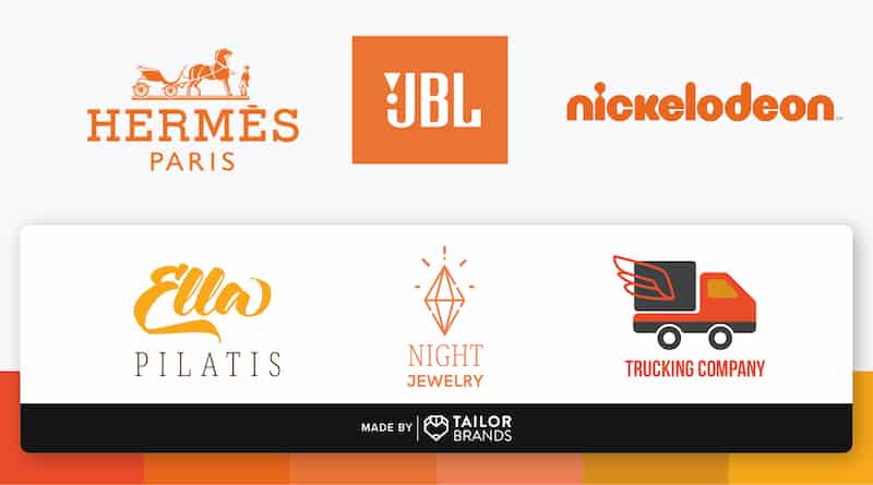
Popular psychology for the color orange include:
- Energy
- Excited
- Prosperity
- Warmth
- Naughty
- Change
>>> Read more about the orange logo
Purple
For brands that want to express sophistication and royalty, purple is the top choice. It is also a great choice for those trying to express their creativity and light-hearted identity. Purple is the top choice of brands such as cosmetics and high-end retail companies. Those looking for a broader, more realistic appeal should avoid bold purples.
Popular psychology for purple include:
- Spiritual Awareness
- Luxurious
- Accuracy
- Honest
- High Quality
- Introspect
Green
Green is one of the quieter colors because it doesn’t force the eye to make any adjustments. The color suggests a sense of balance and calm as well as a connection to nature. Brands looking to portray an opportunity for new beginnings and safety can see green as a way to clear their minds. It doesn’t exude the energetic power of warm colors, so companies pursuing a bold statement may not like it.

Popular psychology for the color green include:
- Nature
- Health
- Richness
- Peaceful
- Harmony
- Fertility
Blue
Like calm waters, blue inspires feelings of calm and mental awareness along with a sense of trust. Blue is a great choice for healthcare and medical brands trying to instill a sense of calm and healing. On the other hand, a darker shade of blue gives corporate branding a sense of confidence and professionalism. However, overusing the color blue can make a brand appear cold and aloof.
Popular psychology for the color blue include:
- Wiseness
- Loyalty
- Spirituality
- Mystery
- Elite
- Respect
Brown
The deep tones of brown convey a sense of seriousness without the stronger overtones of black. It’s still softer, and its connection to natural tones makes it a more grounded choice. Brands looking to portray a sense of quiet support and reliability can do well with brown. Its connection to nature also gives it a rugged yet warm feel.
Popular psychology for brown color include:
- Nature
- Reliability
- Seriously
- Trust
- Protect
- Friendship
Pink
Often considered the most feminine color, pink is nonetheless very versatile. As a lighter red, brands that use pink can retain feelings of energy and cheerfulness mixed with a perception of gentle calm. This is a feeling sometimes associated with sex and sexuality. It also radiates a nurturing light that soothes and reminds us of the feminine principle.
Popular psychology for the color pink include:
- Physical tranquility
- Warmth
- Love and cherish
- Sex
- Romantic
- Girly
Grey
Unlike many other colors, gray is one of the most neutral shades available. Brands often choose it for its timeless, practical, and unbiased feel. It is ideally used as a secondary color to provide a softer and more neutral background to bold colors, although some companies (like Apple) use it with great success.
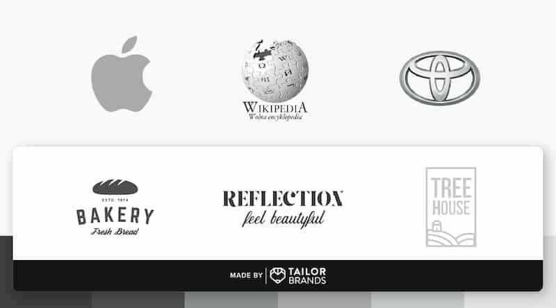
Popular psychology for gray include:
- Practice
- Effective
- Timeless
- Classic
- Serious
- Mystery
Black
Considered the absence of color, black can still be a strong color to include in a brand. Traditionally, black is considered a symbol of professionalism and seriousness. However, it can also be used to evoke feelings of luxury, quality, and power. Brands that choose black are looking to make a powerful statement and convey a sense of power and respect.
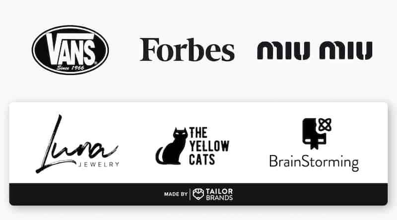
Popular psychology for the color black include:
- Power
- Power
- Intelligence
- The glamor
- Luxurious
- Modern
White
White tends to be overlooked or downplayed in the background, but this neutral is very important. It can act as a secondary color for contrast and can provide a clean, simple background to the logo. White is a reflective color that represents purity, sophistication, and efficiency. Brands that are trying to convey a level of exclusivity and luxury can use white to great success.

Popular psychology for the color white include:
- Toilet
- Purity
- Clean
- Clarity
- Youth
- Innocent
Conclude
Color is an important aspect of your brand identity. When you create a logo, you should take some time to consider what each color says about your company. Understanding the right color mix can help you communicate your message better.
Think about the emotions you’re trying to elicit and how you want consumers to react to your brand. By choosing the right color combinations, you can help your brand leave a lasting impact, forming a stronger connection with your audience.


