If you want a logo design that’s both manageable and tells your brand’s story on your behalf, nothing is more appropriate than a square logo.
Square Logo is highly versatile, demonstrating organizational strength, reliability and discipline.
But why is the square logo capable of having such a strong impact on customer psychology? Find out in the article below.
The psychology behind the square logo
Each block represents a different personality trait. Therefore, it is necessary to study the psychology behind the basic logo shapes.
The circle gives a feeling of harmony, wholeness, completeness. The triangle, on the other hand, has multiple meanings according to the direction it points to. For example, if the direction is upward, it will bring dictatorship and power, and the opposite direction will be instability, rejection.
From a psychological perspective, the square is a highly expressive figure, symbolizing many positive emotions: trustworthiness, strength, persistence and rule-obeying. These are all ideal attributes for branding. (Although they must be considered for their suitability with the products/services the business provides first.)
However, don’t make the mistake of thinking that every part of the logo needs to be square. Sometimes the square is just a small symbol that is integrated into the overall logo.
Let’s decipher the meaning behind 17 popular square logos right here:
17 cult square logos
1. BBC

The British Broadcasting Center (BBC) has an extremely minimalistic yet effective logo. Although this classic design is not very popular today, in the 80s, this was a logo modernization, blowing a new, more luxurious breeze into the design.
This design consists of 3 black squares surrounding white lettering. Because BBC develops multi-channel media, a slightly simpler logo allows them to apply them to all publications quickly and conveniently.
2. American Express
For a financial company, it is perfectly reasonable to use a square logo because they want customers to clearly feel safe and secure. That’s exactly what American Express has done with its logo. The company uses a blue logo , accompanied by the brand name in a simple sans-serif font.
If you pay close attention, all three main elements of the design are thick and solid, representing a solid foundation and reliability. The blue color, square logo design plus modern bold font have come together to deliver the brand message brilliantly.
3. Gap
Gap’s square logo was so iconic that when the company tried to rebrand in 2010, public outcry was so overwhelming that the new logo was withdrawn. It took only a week for Gap to realize this and immediately returned to the beloved logo.
It’s easy to see why consumers love it so much. The pyramidal typeface is the perfect bridge between professionalism and modern and youthful. Meanwhile, the dark blue background is a cheerful touch, making the design less serious.
4. Lego
Each of us has held a Lego toy in our hands, no matter what stage of life we are in. This is such a popular brand that its white, red, and yellow logo is recognizable by children to adults. Lego’s logo uses colors and shapes to convey the message: its toys are safe and fun.
5. Microsoft

Microsoft incorporates 4 squares into the logo to represent the brand of the business. Red is Microsoft Office, green is XBOX, blue is Windows and yellow is Bing. This logo is highly figurative, but because of the symmetrical feature of the square, the logo still looks eye-catching and neat to the viewer, while conveying the full meaning behind.
6. Domino’s Pizza
Just looking at it is fascinating is the opinion of people about the logo of Domino’s Pizza. That is the impact of ingenious brand strategy on consumers.
Domino consistently uses the logo in all of its stores, packaging, delivery services or promotional campaigns. Whether you’re looking at it horizontally, vertically or sideways, the Domino’s logo is incredibly recognizable.
7. Uniqlo
The brand name was originally an abbreviation of “Unique Clothing” but later omitted “C” and “Q” and “Uniqlo” was born. Despite being a Japanese business, Uniqlo has successfully gained a huge market share in the international fashion industry. This red logo is typical of a successful square logo, expressing enthusiasm and aspiration to rise strongly.
8. 7-Eleven
Although not a flashy, familiar name in the high-end department store segment, 7-Eleven is certainly, extremely popular. This is a place where customers can go to any day or night to buy their favorite snacks or drinks.
The company’s logo design includes a lot of elements that help attract customers’ attention. Whether the whole design encapsulates in a square. The curvature of the number 7 and the intentionally non-capitalized “n” give the logo a softer feel.
9. T-Mobile
Most of the above logos are designed in a square. T-Mobile’s logo is the opposite of the majority. The square in the logo acts as a connection between the characters, emphasizing T-Mobile’s global connectivity.
10. Cartoon Network
The iconic CN logo wasn’t always so simple. Previously, it had a 3D format, but the company decided to simplify the design. The current logo consists of 2 opposing black and white squares with 2 initials of the brand name. The slightly mischievous font is the point that makes the logo closer and more vivid to the children.
11. LinkedIn
Born as a social network for businesses, the online platform LinkedIn helps connect professionals around the globe. Therefore, it is not surprising that the company’s logo design is very “digital age”.
The word “print” is completely in the blue square, so LinkedIn easily customizes the size of the logo, especially on small interfaces like smartphones.
12. Swatch

The Swatch logo has two main elements: the brand name and the square flag of Switzerland. Switzerland is the world’s leading watch producer. The flag placed in the logo implicitly reaffirms the quality for the brand.
13. Instagram
Like it or not, Instagram’s logo has adopted a minimalist design to highlight the most outstanding feature of the application – photography. The gradient color used by Instagram is inspired by the sunrise.
14. The Home Depot
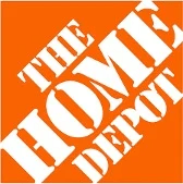
The Home Depot is a retail brand that offers noiseless construction products for households. The brand’s impromptu logo looks like a stamp marked on a box. This is purely intentional design. The orange logo background helps to encourage purchases while at the same time demonstrating reasonable pricing.
15 & 16. Goldman Sachs + The Weather Channel
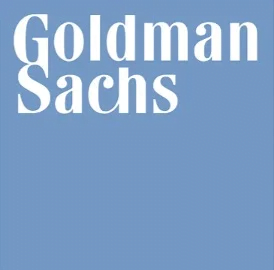

These 2 logos have similarities when they both use the form of squares with colored backgrounds with white text. Both brands want to demonstrate reliability, strength and premium quality.
17. Bank of America
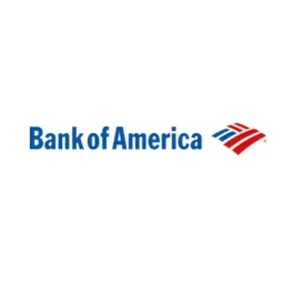
It is relatively difficult for a banking brand to design a logo that is fresh and liberal. But Bank of America was very clever when using the square logo to represent the American flag in an extremely youthful and modern design overall.
Some tips when designing square logos:
We’ve put together the examples above from all sorts of different industries to show you how versatile a square logo can be. Here are some additional tips for you to consider when designing your square logo:
Icon, Wordmark hay Monogram?
Depending on the length of the brand name, sometimes the logo should be shortened by just initials. Otherwise, it’s quite difficult to deal with the cluster of letters that fit in a square. If you are considering a wordmark logo, try making the squares more abstract to create a different highlight for the logo.
Color is important:
The logo examples above mostly fill in the squares, but that’s not always necessary. Try creating a border around the square and leaving the background blank if you want to create a minimalist, clean feel. In case you want an eye-catching logo, a bold and prominent color is a reasonable choice.
Research your opponents carefully:
In almost every industry, fierce competition is inevitable. Researching about competitors such as: what they have done, are doing, how they deploy, … can bring many lessons for your own brand.
Message for you:
With all the tips and tricks above, add a square logo to your brand design if you want to give your brand a sense of credibility and energy!
Why not try our logo design services !
If you are looking for a reputable and experienced unit to be able to design a professional and impressive logo and brand identity system , then please contact us immediately by phone. 0988 622 991, or leave your information and requirements, Malu Design ‘s consulting department will contact you right away to answer all your questions!
————————
Malu Design – Branding Identity Agency
Hotline: 0988 622 991

