When you see the logo of your favorite brand, it can make you feel excited, relaxed, motivated — whatever the feeling, it draws you to that brand.
According to researchers, it only takes us about 400 milliseconds to attach a particular meaning to an object after we see it.
Each logo conveys a meaning to the customer in less than half a second. If customers do not recognize a brand, they will doubt the brand at first until they can prove the assumptions to be true or false. On the other hand, the brands they are familiar with already have a solid perception of product quality, customer service, value, popularity, and more.
Let’s see how it works!
Logo influences purchasing choice
Logo design is important because it affects the assumptions about the brands they represent.
You have different feelings for Nike than Russel, Adidas or Air Jordan, don’t you? Even though they do similar things. When you see their logo, you have subconscious feelings about the brand based on their past experiences and branding choices.
The same goes for you: When people see your logo for the first time, they form a certain perception of your brand.
If the perception is good – they think you will create value and deserve to be trusted – then you will have to be embarrassed to change their feelings. However, if the perception of the logo isn’t good – looks cheap or amateurish – then you have an uphill battle to fight for even a chance to prove something different. You’re behind the ball of eight if the logo doesn’t fit your brand.
Now, there are several design elements that can play a role in influencing audience perception of a brand, starting with fonts:
Psychology in the font
There are thousands of fonts — maybe a million or more to choose from — in existence. While some fonts are expertly crafted, offering nice symmetry, flow, and spacing, others are clearly amateurish and will devalue anything they’re made of. use.
Brands will often choose 1-2 fonts for their logo and another standard font used in the body of websites, flyers, and more.
Different types of fonts will create common perceptions when combined with other design elements for logos or branded materials. Here are some of the most popular logo fonts:
Serif fonts
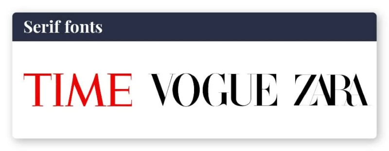
Times New Roman is possibly the most classic example of a serif font. The small line or stroke hanging from the top, outer corner of the letters is what makes this font a serif font.
The serif fonts are classic, formal, established, authoritative and trustworthy. They tend to look unimaginative, conformist, and well-groomed. In the right setting, this creates a confident and timeless branded look. In the wrong logo, it looks like no thought was put into the font selection.
Time magazine uses Times New Roman for its classic headline. Vogue used a modified version of Didot to create a special edition of its logo. The Zara brand also uses Didot in their logo, although the kerning (space between letters) is reduced, bringing all the letters together.
Some examples of popular serif fonts are Times New Roman, Bodoni MT, and Georgia Pro.
Sans-serif fonts
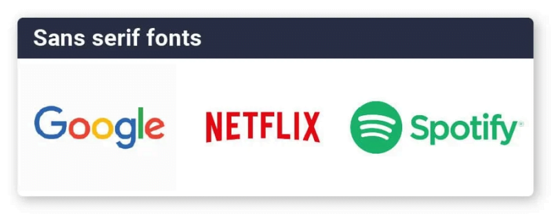
“Sans” means “without”, so sans-serif fonts do not have small accents on top of letters. Arial is the most classic form of this font, although Microsoft’s decision to default to Calibri in 2007 could soon put it at the forefront of the commonly used sans-serif font. The company recently announced that they are in the process of setting a new default font for the future.
San Francisco is now the default sans-serif font for iPhone and iPad.
Sans-serif fonts are clean, modern, simple, understandable and honest. They show forward thinking and agility.
Google’s multicolored logo uses Product Sans — a typeface that Google created in 2015 for logo purposes. Netflix used Graphique, initially with a heavy shadow, before switching it to a more modern (and flat) version. LinkedIn used a combination of Myriad Pro-Bold for “Linked” and Myriad Pro-Black for “Print” to create their logo.
Examples of sans-serif fonts include Ariel, Helvetica, and Verdana.
A word of caution: NEVER, NEVER use Comic Sans in logo design or branding — that ugly sans serif font has become the laughingstock of anyone with any design sense and will instantly mark your brand as amateur and out of place!
Slab-serif fonts
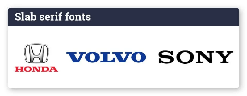
Slab serifs use thick, horizontal slabs to form letters. You will notice little or no change in the thickness of the strokes as they bend. The serif marks are even thick and horizontal without much taper.
The slab serif font is bold, confident, and straightforward. They show a bit of attitude without going beyond professionalism.
Honda uses a recognizable logo with a custom header typeface to contrast with their “H” logo. Sony created its own Sony Font, although it is very similar to the original design made with Clarendon. Volvo also uses Clarendon for its slab serif logo.
Other examples of slab-serif fonts include Rockwell, Memphis, and Neutraface Slab.
Some printing processes (such as screen printing) limit the number of colors you can use. Others won’t be able to create gradations easily or won’t be able to include small details (like embroidery on a hat or shirt).
You may be limited in the type of printing you can make if you choose a complex background. You can also create a version of the logo that doesn’t include a background for these cases.
Script Fonts
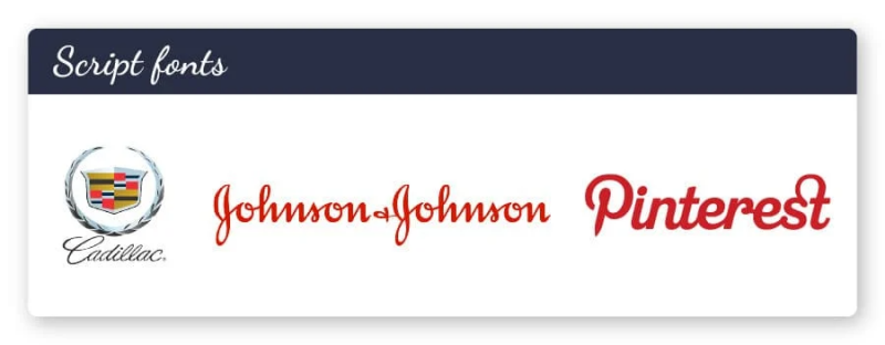
The handwritten lines are charming and beautiful. When used properly, they bring out a feminine quality and set the brand apart. Designers are wary of script fonts, as they can also be difficult to read quickly.
A script font will express creativity, elegance, and compassion. Script fonts make the logo look unique and distinct.
Pinterest created their own script “P” to make up their logo, which has the shape of an abstract push pin. Cadillac relies on English 157 with the assumption that you already know their brand. Johnson & Johnson uses the Adelica Brush Regular version for their recognizable font.
Examples of script fonts include Brush Script MT, Script MT Bold, and Vivaldi.
Display and decorative Fonts
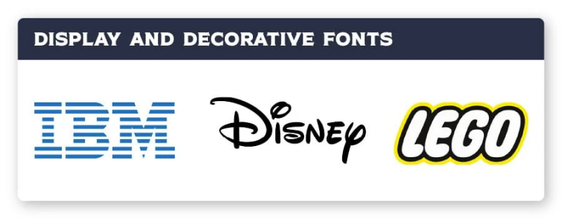
Companies that create their own versions of fonts can break the rules for conventional fonts and enter the realm of something else.
Display and decorative fonts are stylized, distinctive, dramatic, and fun. They break the mold unrepentantly. In most cases, you really need a font designer to create a truly unique decorative font for your typeface.
Disney has an iconic logo with an almost script font. IBM uses a stylized slab serif with lines through it for a distinct look. Lego uses playful bubble letters in a sans-serif font that can only be identified by its brand.
Examples of display and decorative fonts include Jokerman, Showcard Gothic, and Ravie.
Color psychology of logos
Colors have meanings in our minds. Color makes us feel excited, calm, motivated and energetic. Logo colors use our natural responses to color to evoke emotions about the brand.
Black and white
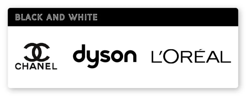
Usually gives an elegant, confident and mature look. Black and white logos are very popular in the fashion industry. Examples of brands with the B&W logo include Chanel, Loreal, and Dyson.
Gradient colors
A creative approach to color might include a change from one color to another. Gradient colors tend to look modern, unusual, and controversial. Gradient logos are not a classic choice because historically they won’t print well, but the use of digital and improved printing technology has reduced this problem. Examples of brands using gradients include Instagram, Firefox, and Asana.
Bright colors
Using yellow, orange, red and other bright colors can create a higher level of energy. Bright colors are youthful, dynamic and excitable. Brands that appeal to children often use bright colors to help catch the eye. Examples of brands that use bright logo colors include Spotify, Lyft, and McDonald’s.
Psychology of logo shapes
Each shape in the logo design will also convey certain emotions. Logo shape can have the most immediate impact on what it means to consumers.
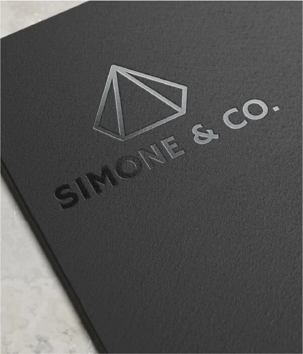
Geometry
More structured and harsh, geometric shapes can convey stability, reliability, and action:
- Circles often represent movement and unity
- Taken from nature
- The square is a symbol of strength and longevity
- Lines can illustrate future thinking and energy
Natural shape
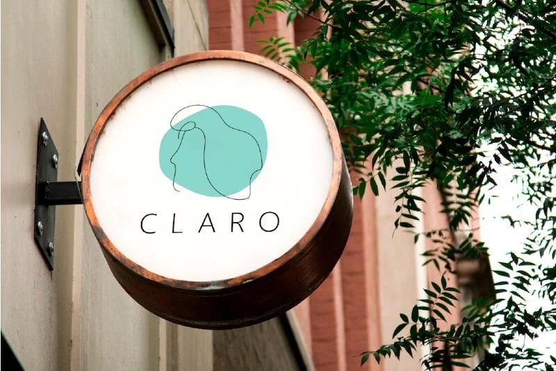
Often used for more natural-based brands, organic shapes are natural and feel comfortable. Some organic shapes may include fragments, like the Nickelodeon logo, representing energy and youth.
Organic shapes are not limited to the rules of geometric shapes, so they often convey a more agile and flow-oriented brand.
Abstract shapes
Abstract logos are trying to convey a feeling rather than a specific meaning in their logo. Pepsi is a great example of a brand that uses abstract shapes to create sensations.
This can make a brand appear edgy, modern, and connect with their audience. Abstract designs can form compelling logos that make people stop and think about the meaning they are trying to convey.
Psychology of composition
The brain is wired to read information. So when looking at a picture, we tend to scan from left to right. When it comes to art and design, the goal is to keep an eye on the visuals. Logos can attract people with the right layout.
First of all, the core of the brand must stand out in the logo. The most important element will be the one that stands out and is the most noticeable. You can further establish this focus by using slightly thicker outlines around the shape, increasing its size, or using a contrasting color. In complex logos, establishing a clear focal point is especially important.
Next, notice how the eye can be thrown out of the design. When your eyes look in from the left side of the design and towards the right, should you continue?
Using a line that closes off one side can help the eye roll back on a second look. You can’t keep people forever, but good design will keep them there a little longer — which means more time to make an impression.
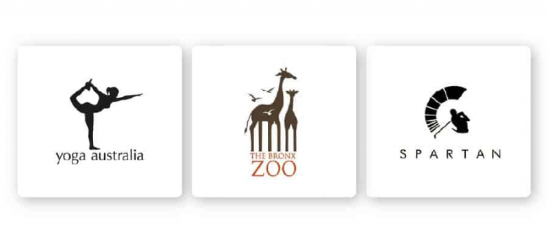
Use negative space and hidden meanings to create more engaging details that will attract attention. Great examples of this include Yoga Australia, Bronx Zoo and Spartan Golf Club
For you
Brands will be represented by logos, so create a logo that really communicates all the right things to your audience and helps shape their view of your brand! Get started today using our services and design your own company logo.
If you are looking for a reputable and experienced unit to be able to design a professional and impressive logo and brand identity system , then please contact us immediately by phone. 0988 622 991, or leave your information and requirements, Malu Design ‘s consulting department will contact you right away to answer all your questions!
————————
Malu Design – Branding Identity Agency
Hotline: 0988 622 991

