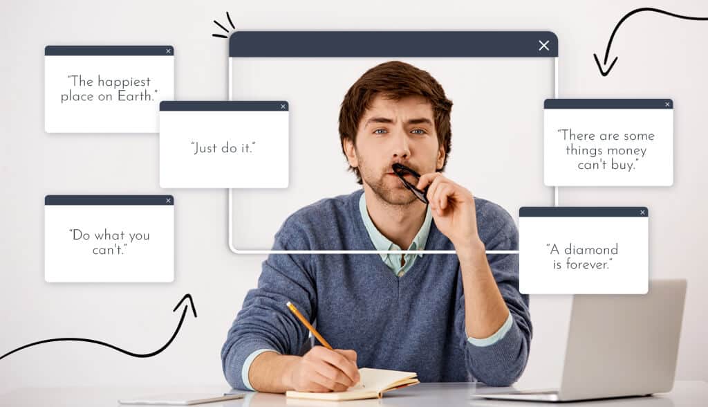
Let people know that not all runners like to wake up at dawn to finish that long distance (ahem, me). Lying in bed and sleeping for another hour is a tempting temptation.
But as soon as I see my Nike sneakers next to the door, it’s a silent attempt to move. And I thought to myself: “Just do it”. It becomes a spell. Every morning, I see the Nike logo—that swoosh is like a check mark on my daily to-do list—and I’m motivated to do it.
That’s what a great logo tagline can do.
Let’s learn what a logo intro is (and how it differs from a Slogan), some examples of intro lines, and how to include one in your logo design. Let’s do it!
What is Logo Tagline?
A tagline is a phrase that highlights a business, emphasizes a specific value or message, and/or clarifies the brand’s mission. You can think of a Tagline as a brand’s mission statement condensed into a few words.
It can be an important part of your brand identity . McDonald’s “I love it” or Coca-Cola’s “Taste it” comes to mind. These phrases are almost (if not equally) as iconic as the famous golden domes and red and white lettering logos.
Just like McDonald’s and Coca-Cola, you can use Tagline to enrich your brand image. Referral lines perform many of the functions necessary to drive your brand forward. In just a few words, you can elevate your brand above your competition and capture the attention of your audience by letting the world know who you are and what you care about.
Ultimately, referral lines are a powerful way for your customers to connect with your brand and foster brand loyalty.
Tagline Logo Intro Line Example
The following are business taglines spanning multiple industries to demonstrate that a good tagline is engaging, concise, and timeless.
Wheaties – “Breakfast of Champions”
Have you ever heard your parents say that you should eat Wheaties before an important event? There’s a reason for that! Wheaties have worked hard to maintain brand recognition through their close association with sports.
The famous tagline was first used in the 1930s and is known to feature prominent athletes on its packaging. From soccer stars and coaches to pilots and skydivers, nearly every sport imaginable offers Wheaties testimonials and praise.
To this day, Wheaties is still considered the breakfast of champions.


Evian – “Natural Fountain”
We often take it for granted when we have access to naturally cool water. Evian gets its water from the French Alps, so you can enjoy natural spring water anytime, anywhere. When you have a product that is a vital, life-sustaining need such as water, you don’t need a Tagline logo to say anything more than that. By keeping it simple, your logo tagline will say a lot about your brand.
Nike just does that.”
As I mentioned earlier, Nike’s message is one that easily resonates with people. Brands have become not only sportswear, but also a way of life. It encourages you to overcome any obstacles you face in life. It tells you not to let anything stand in your way.
Apple – “Think Different”
Apple’s tagline “Think Different” was first used in an ad called “This is for the crazy”. The line and tagline pay homage to the visionaries and pioneers who challenged the status quo and changed the world. If that doesn’t inspire, I don’t know what is.
Soon after, Apple rose to unprecedented popularity. Most importantly, the Tagline is a call to action and instantly infuses customers with a sense of belonging to icons like Albert Einstein, Martin Luther King Jr. and Mahatma Gandhi.
L’Oréal – “Because You Deserve”
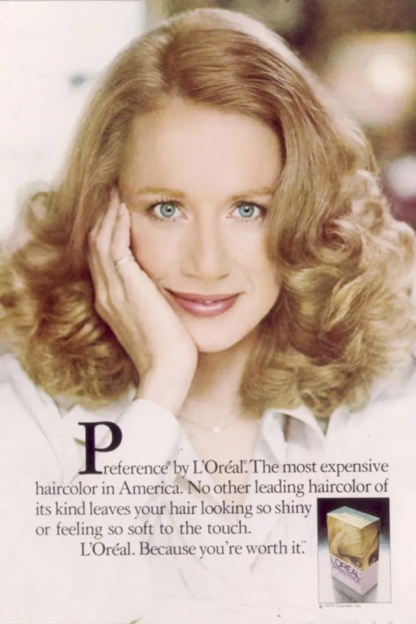
It’s been 51 years since L’Oreal’s Tagline was first announced, and the message of empowerment is as relevant as ever. At the age of 23, Ilon Specht was working at L’Oréal Paris New York in 1971 when she first came up with the phrase after getting bored with constantly writing ads through the male gaze.
Specht’s words and concepts caused a change in the beauty advertising industry, which until then relied solely on male voices. More than half a century later, the message still holds a place in society and serves as an important reminder for all.
Marines – “Small. Pride. Marines.”
“This slogan reflects the uniqueness of the Marines and emphasizes the high quality of those who join and serve their country as Marines,” said Major General Richard T. Tryon, general. command, the Marine Corps Recruiting Command said. Indeed, it does.
Advertising Week, the largest and most prestigious annual meeting of advertising and media executives in North America, named the Marines on the Walk of Fame for their Tagline in 2007.
Tagline is so effective because it evokes a sense of pride, belonging, and privilege for those who serve in the Marines.
Difference between Tagline and Slogan
The terms “logo” and “tagline” are often used interchangeably, but they serve different purposes.
Unlike Tagline, Slogan is usually used for only one product or campaign. When businesses want to focus on a new topic or idea, they change their slogan.
However, introductory lines are timeless and rarely change as they represent a brand. Essentially, a tagline is a catchy phrase that evokes your brand image in the customer’s mind. It helps people associate your business like me with the Nike swoosh.
How to use Logo Tagline properly
A Tagline has tremendous power to boost your marketing strategy if implemented properly. Here are some tips to guide you as you think about your logo tagline:
Define what your Tagline will achieve
Think about why you created a Tagline in the first place. Is it to show people why your company is different? To inform people about what your company does? As you write your introduction line, don’t stray from your intended purpose; Focus on the message you want to convey.
For example, if you think it’s most important to share information about your product or service, that information should be in your referral line. On the other hand, if you strongly believe in a set of values and you feel that your audience will connect with those values, then your tagline should focus on purpose, principles, and ideals. of the enterprise.
Then there’s the distinct Tagline, intended to make your business stand out from the competition. You can think of Tagline Differentiation as a phrase that answers the question, “What makes my company different from others?”
There is also an informative Tagline that explains exactly what your business does. If you have a small, relatively obscure business, or a generic business name that doesn’t reveal much about your business, an informative introductory line might be a good idea.
Describe your product
For many businesses, the logo tagline functions as a way to describe your product or service. This is especially true for small businesses that do not yet have brand recognition.
For example, a family-owned restaurant could benefit from a simple descriptive logo Tagline, such as “Home cooked Mediterranean food”. The purpose of such a Tagline is to entice the public by explaining what the restaurant has to offer. In this case, a simple description of the dish may be more appealing to a hungry audience than a vague, albeit more emotional, tagline.
Evoke emotions
Brand is all the emotions and perceptions that you intentionally develop around your business. The introductory line helps your target audience connect with the essence of your brand. And when you tap into the emotions of your audience—magic happens.
Subway’s “Eat Fresh” is both descriptive and emotional at the same time. It not only describes what the sandwich chain has to offer but also attracts the audience by ordering fresh food and healthy lifestyle.
Other Taglines are purely emotional. Bank of America’s slogan, “Life is better when we’re connected,” embraces several of the bank’s attributes: Digital connectivity, strong customer relationships, and a sense of community and union conclude. Combined, these attributes turn what appears to be a remote corporate entity into a friendly and accessible business.
L’Oréal Paris’ classic logo “Because you’re worthy” also evoked a strong emotional response in the audience. Buying L’Oréal, the message implies, is empowering and women deserve to treat themselves to beauty products.
Keep it flexible
The best logo tagline is easy to remember. They have a specific tone and flow, and they are usually no longer than 4 or 5 words. Short and engaging taglines like General Electric’s “Imagination at Work” are memorable and concise.
Other logos are versatile because they use rhyme, repetition or puns: “Maybe she was born with it. Maybe it’s Maybelline” highlighting the wordplay “maybe” and “Maybelline” to emphasize the company’s brand name.
Bounty’s slogan, “The Quicker Picker Upper” uses rhyme and playful language to highlight their brand of tissues. Dollar Shave Club “Shave Time. Shave money” uses both puns and repetition to describe their business while explaining its money-saving benefits.
Make it timeless
You may want to avoid using words or references that will make your tagline obsolete 5 years from now. Things like “wake up” and “YOLO” definitely don’t belong in your logo intro. However, words like “help,” “achieve,” and “believe” have a chance to make a lasting impact.
Aim to create a tagline that stays relevant for years to come, with it engaging and simple enough to be a timeless classic.
Things to avoid when choosing a Slogan for a logo
Now that you know the basic elements to create a great logo slogan, you should also know the things to avoid:
Length and length
Too wordy is a Slogan logo should not do.
First, a lengthy, overly descriptive introduction wouldn’t be an introduction—it would be a description. Second, it won’t fit anywhere. It won’t look good on your website or marketing materials, and it certainly won’t look good on your brand logo.
To keep your introduction short, reduce your desired intro to the most important keywords. Check where you use redundant words or where you can replace the passive with the active.
Let’s say you want your slogan to be “Good coffee you’ll want to wake up on time”. That’s a lot, isn’t it? But you can break it down into “Coffee to wake up”.
Lack of purpose
Although a slogan is very useful, you should avoid creating a slogan just for the sake of it.
A slogan needs to have a purpose. If your slogan is meaningless, irrelevant or simply meaningless, it will only harm your brand.
Time Warner Cable’s slogan “Enjoy Better” is weak, non-descriptive, and conveys nothing about the company’s brand. Not only that, but the phrase “enjoy it better” doesn’t make much sense. What must we enjoy? And in what way is it supposed to be better?
How to include Tagline in your logo design
Logo tagline can elevate your brand if implemented properly. Here are some tips to guide you when including Tagline in your logo design.
Font Pairing
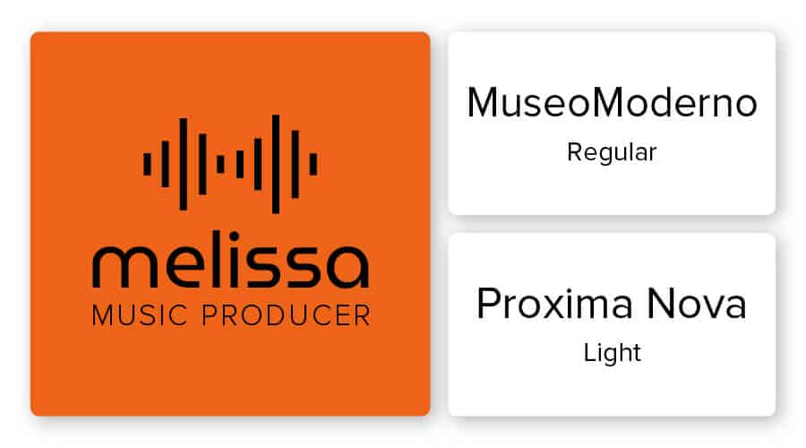
You will want your company name and logo slogan in different fonts to distinguish them from each other. However, you need to be careful about which fonts you pair with each other. If you choose a font that is too messy or conflicting, your logo will appear complicated and difficult to read.
When pairing fonts , the golden rule is to put contrasting fonts together. You can use contrast in your logo design to establish hierarchy, helping viewers focus on your most important elements. In addition to bringing out the focal point of your design, contrast adds interest to the logo.
Some examples of contrasting fonts are serif with sans serif. Or pair a script font for your company name and use a clean, minimalist font for your logo intro. Also, combine weight and size to create contrast between your company name and logo tagline. If you look at the logo above, the word “Melissa” is thicker than the tagline below it.
A final piece of advice is to use an easy-to-read font, especially if your introduction will be written in smaller letters.
Color combination
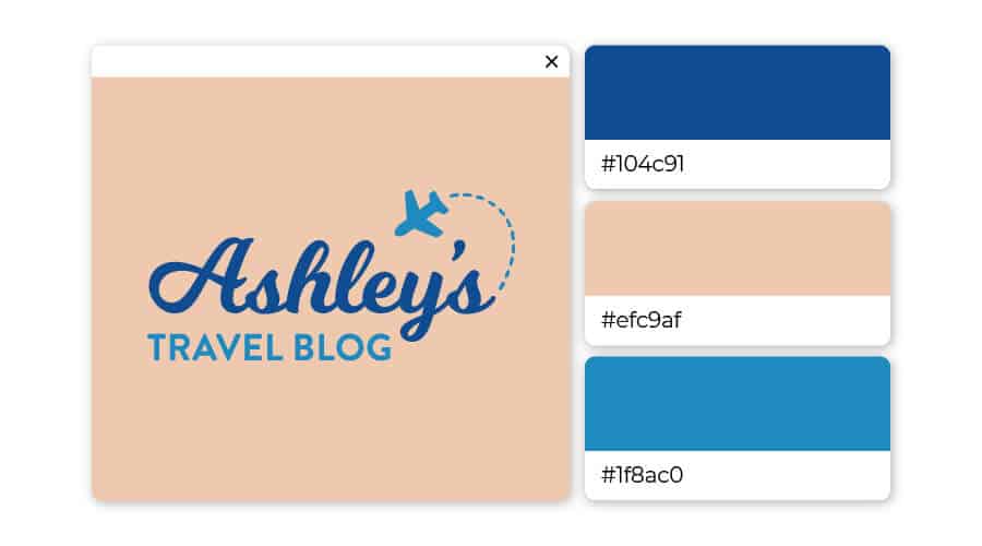
Your brand personality comes from its colors—do you prefer the classic black and white or maybe a soft pink and blue? The trick is understanding color combinations , you can create a logo design that tells your audience exactly who you are and reinforces your logo tagline.
Before you choose a color, think about the emotions you’re trying to elicit and ask yourself how you want consumers to react to your brand.
The first rule of thumb for mastering color combinations is to keep it simple. It is best to stick to 2 colors, up to 3 colors. If you are going to choose 3 colors, it is best to choose 2 different shades of the same color and then add another color to increase contrast. This is exactly what the Ashley Travel Blog logo did by combining a light pink background with dark and light blues to make it stand out.
Size
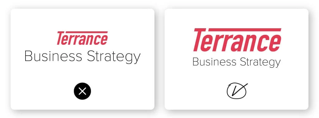
Here’s a rule we strongly recommend you follow: Your logo tagline should be smaller than your business name. The reason stems from a design principle known as visual hierarchy, which refers to arranging certain elements in an order of importance.
Look at the 2 logos above. The logo on the left looks wrong, doesn’t it? That’s because Tagline is bigger than the business name Terrance. The visual hierarchy is completely out of balance. But the logo on the right is properly balanced because the name Terrance is larger than Tagline. It’s all about balance.
Distance
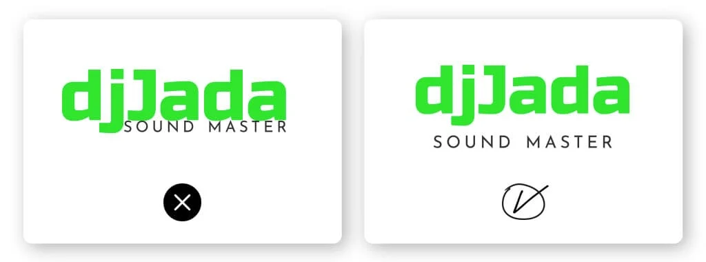
This little tip is pretty intuitive. Take a look at the DJ Jada logo above—the design on the left is mixed together making it hard to read. However, the right design has enough space between the business name and the logo tagline.
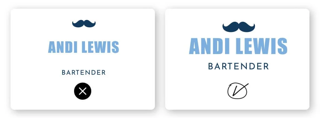
The same can be said in reverse; you don’t want your logo intro placed too far from your business name. Looking at the Andy Lewis logo, it’s clear that the space between words is too big. The logo on the right, however, is just right. It’s all about that Goldilocks ratio.
For you
Your tagline, brand name and logo form an inseparable trinity that is the core part of your brand identity and message.
When you’re brainstorming your introductory line, try to come up with a phrase that represents who you are as a business and that you’ll be proud to associate with your brand in the future.
After you choose the right tagline, decide how you will incorporate it into your brand. Use your logo intro on websites and marketing materials, and make sure when you create your logo design , it aligns with what your brand identity is trying to represent.

