![]()
Icon logo is the heart of your brand. Icon is the main focal point of the logo, representing you as a business and what the business does.
That’s why, whether you’re using a logo design service or designing your own logo, it can be difficult to choose the one that’s best for your new business.
To get you started, Malu Design has outlined everything you need to know about logo icons.
While it may sound overwhelming to learn, by the end of this guide you’ll have chosen the best icon for your brand.
Start.
Why do you need a logo icon?
The simple answer is: You don’t need to.
Established companies like Kleenex and Coca-Cola have grown their businesses to such heights that their names alone have become representative of the names of the products they sell.
However, as a new business owner, chances are you’re still laying the groundwork for building a strong brand identity.
Think of it this way: A logo icon can create more emphasis than just your business name. It can grab people’s attention and elicit an emotional response related to your brand.
Different types of logo icons
There are several different types of icons, including abstract, geometric, pictograms and icons, interactive and custom. Each type has its own meaning and intended use. Let’s break it down so you can understand which one is right for your logo.
1. Abstract logo icon
As the name implies, an abstract image conveys many different concepts and emotions in a single symbol.
These icons include geometric shapes to represent your brand, such as icons, shapes, patterns, and illustrations drawn with lines. Usually, it is paired with a word mark for clarity and flexibility.
This type of logo icon is suitable for brands that have a lot to say. Let’s say your company’s brand value is exceptional customer service. A smiley can be fine, but an abstract design with the right color and shape combination can take it to a whole other level.
If you want to create a really unique logo that sets itself apart from other brands, an abstract logo is a great choice.
Remember that abstract icons are often used by companies that have a lot of advertising bandwidth (I am talking at TV level) and already have a name. So if your brand identity and reach is still in its infancy, you may have a hard time conveying the emotions and feelings you want your audience to associate with your brand.
Pepsi
Take Pepsi for example. Their current logo is circular, with waves of red and blue punctuated by a central white stripe running along different angles. To add depth, the globe is tilted to the side, purporting to use negative space to evoke a smile.
As with most abstract designs, there is a method that causes madness. Pepsi’s designers explain that they used what’s known as the Golden Ratio to determine the perfect angle for the globe (they even compared it to the Mona Lisa!). While that comparison is still up for debate, the Pepsi logo continues to deliver the brand experience people have come to know and love.
Huawei
Huawei’s logo is abstract in the sense that even the company doesn’t specifically mention what it is.
Some people compare the logo to the sun and its rays; others suggested that the logo could be electromagnetic radiation emitted by an antenna. And still, others see a flower-shaped logo representing the word Hua, which means ‘petal’ or ‘luxury’ in Chinese. The second syllable in the company name means achievement or action.
When an icon is interpreted, it has achieved the concept of an abstract design.
Nike
The Nike logo is recognized worldwide, however, it does not include any representations of sports equipment. This logo is so unique that there is no need to rely on a sports symbol to convey its message.
Fame was now a risk when Nike was created. Brands put their trust in product packaging design. An abstract logo takes time to become recognizable, and the Nike logo is no different.
2. Geometric logo icon
From circles to squares to more complex shapes, geometric logos are a popular choice across all industries.
The mathematical precision of geometric shapes can provide a sense of stability without feeling cold and calculating. For example, a circular shape can give a brand an eternal, flexible feel.
Reeboks
Sports product brands have seen a number of changes in logo design over the years.
In 2014, the company had a plain red logo for the first time. The three lines that make up the triangle symbol represent the three major challenges that every athlete must go through as they reach their limits: Physical, mental, and social.
But in 2019, Reebok reverted back to the original logo icon created in 1993. The 4 trapezoidal under the word Reebok appears to be a reconstructed version of the red triangle symbol used earlier. .
Spotify

Popular music apps use a simple circle to contain sound waves in their icons.
To appeal to their target audience, Spotify’s neon green logo is modern and appears right on the screen. Its unique colors, shapes, and typography qualifies as a minimalist logo that connects well with the audience.
National Geographic
Since its introduction in 1997, the National Geographic Logo has been one of the most recognizable television channel icons.
The rectangular yellow portrait frame icon is often said to represent the sun, symbolizing the channel’s global reach.
3. Logo image icon
An image icon is sometimes called a brand mark or logo symbol. Basically, it’s an illustration of a real object. That’s probably the image that comes to mind when you think of a logo.
This type of graphic-based icon can reinforce the brand name and help it make a mark in the customer’s mind.
An image from your business name can be easily created, in which case a graphic logo might be appropriate.
Apple
Companies like Apple use an image icon to literally represent their company name.
By using an image logo, Apple has the flexibility to inject their own brand personality into the image (an image with a bite mark on an apple), which they cannot do with just their name.
Although a bit less obvious than Apple, Twitter created its iconic bird icon to represent tweets – an accurate depiction of what the brand is used for.
You may notice that the design does not include the company name, the reason being that the bird itself is enough for instant brand recognition.
Puma
The iconic dancing leopard logo was first introduced in 1948 and is pretty much the image we all recognize today. The first design featured a leopard jumping over a letter “D,” which stands for the company’s founder, Rudolf Dassler.
Puma’s design conveys movement, power, and power. Any sports fan and athlete can connect with the traits of the Puma cat.
4. Family coat of arms icon
Historically, coat of arms and coat of arms are two of the earliest forms of brand mark. Given their history, heraldic and crest symbols convey a sense of trustworthiness and prestige.
Both the crest and coat of arms icons combine the doodle image seamlessly with the text. These companies do it very well:
Stella Artois
The much-loved beer brand holds the title of being one of the oldest icons in the world. Founded in 1366 in Leuven, Belgium, the logo was first used when the brewery was founded. Although hundreds of years have passed, the original horn symbol remains unchanged.
The badge symbol speaks to the brand’s 600-year brewing heritage. A decorative frame surrounding the company name is representative of the architectural style in the city of Leuven. Consisting of white, yellow, black and red, the color palette conveys luxury and class.
Harvard University

The prestige associated with the territory is a top university.
The Harvard logo is a shield painted in bold red that represents excellence, while the shield’s angular shape conveys strength and authority.
The shield contains 3 open books stating the university’s motto. And, the Latin word for truth is written all over the open books to highlight the importance of learning.
Harley Davidson
You don’t have to be a motorcycle owner to recognize the iconic Harley Davidson logo. Now one of the largest motorcycle manufacturers in the world, you might be surprised to learn that Harley Davidson was founded in a warehouse in 1903.
Its orange and black color combination creates a bold logo like those of the brand’s iconic motorcycles. The shield itself is meant to convey the sense of power and authority you get from riding a motorcycle.
5. Interactive logo icons
As with most works of art, an interactive icon is the one used to explain the business. Sometimes a symbol can have several different meanings depending on who is observing it. That’s what makes an interactive icon so captivating!
An interactive icon is a dynamic interaction between an icon and text, like the Amazon logo.
Amazon
The word Amazon means “massive,” and that’s exactly what the e-commerce giant wants its logo to represent.
The orange arrow in the Amazon logo serves a dual purpose. First, it is shaped like a smile, subtly showing the grinning faces of satisfied customers after receiving their packages.
The second purpose of the logo is the orange line connecting the letters “A” and “Z”, implying that you can find everything you need – from A to Z – on their website.
Home appliances
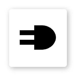
This clever logo is a great use of negative space to make a logo stand out. Using the first 2 letters of the power supply company side by side, the design appears as a power plug and the initials ED.
Flight Finder
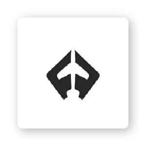
Flight Finder’s minimalist logo is another logo that makes effective use of negative space. The symbol combines the first 2 letters on a corner to create the shape of an airplane in the center.
This type of icon forces the customer to look at the logo a little longer to figure out exactly what they are seeing.
6. Custom logo icon
A custom icon is a personalized design tailored to your business. This means that the logo icon includes the direction and customization desired by the business owner.
If you have a certain vision that you would like to see incorporated in your logo design, a custom logo is for you.
It is important to be cautious when designing icons that are too detailed or complex, as they will be difficult to see when resized (e.g. business cards or mobile screens). And, make sure others agree on your custom design, so you can be sure it will have the right impact on your target audience.
Unilever

Anglo Dutch consumer goods company has a seemingly simple logo design. The brand’s logo is shaped like a “U” but if you zoom in more closely you’ll see that the design is made up of 25 distinct icons, each representing Unilever’s sub-brands.
There is a DNA double helix symbol representing biological science; a bee icon of hard work; and a spoon icon for nutrition.
Boeing
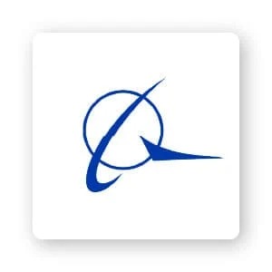 In 1997, when the aerospace company Boeing merged with competitor McDonnell Douglas, they combined the symbols to create the logo we see today. The McDonnell Douglas logo of a sphere with a ring around it has been added to the Boeing logo.
Inside the logo, Boeing is written in a modern typeface, its letters are bright blue to represent the sky. The logo itself aligns with the company’s determination to reach new heights while maintaining a sense of balance.
How to choose an icon for your logo
Now it’s time to choose your own logo icon. Here are some steps to make sure you choose the right icon for you.
Define your brand’s core message
Your icon will act as the main visual focus of your brand. Regardless of what your audience already knows, they will instantly make a judgment about your business within seconds of seeing your logo.
So it’s important to think about the traits you want to overcome. Is your brand professional, trustworthy, traditional, playful? Decide what your brand’s core message is and only then start looking for icons that can convey that message.
Stick with simplicity
If your icon design is too complicated or difficult to distinguish what it is (is it a bird, is it an airplane?), you will lose your audience. They will have a hard time understanding what your brand is about, and as a result, they’ll move on.
Plus, simple designs are easier to scale up and down to use across all of your marketing mediums, both online and offline.
Keep logos related to your industry or company name
The Apple logo is famous because it is the literal expression of the company’s name. By itself, an apple has little to do with a computer. That brand alignment only happened after Apple established a leadership position in the computer and technology industries.
If your brand is still unknown, you can strengthen your brand’s niche by using an everyday item in your industry or what you think your best-selling product will be. Assuming you’re a sporting goods store known for its high-end climbing gear, you might consider the climbing rope icon.
Don’t be afraid to give others comments
Designing a logo on your own can seem daunting.
But once you have some ideas, consult your friends and family for feedback before you decide on a design. You might be surprised at some of their reviews, and it’s important to have an unbiased opinion on how the logo will reach your customers. There is a simpler way, that is to let Malu Design design the logo for you.
If you are looking for a reputable and experienced unit to be able to design a professional and impressive logo and brand identity system , then please contact us immediately by phone. 0988 622 991, or leave your information and requirements, Malu Design ‘s consulting department will contact you right away to answer all your questions!
————————
Malu Design – Branding Identity Agency
Hotline: 0988 622 991

