Design principles give us a universal view when you create a design, based on which you can shape and determine the right style for the design.
Each principle is a conclusion of many experienced designers, for newbies it is very important to master design principles as it helps you to create a more professional design. and make the design uncluttered and confusing. Of course, the principle was born for us to break, but you need to understand it well to break but still create efficiency through the following article of Malu Design.
1. The Law of Hierarchy
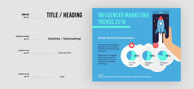
The law of hierarchy in design space is an important factor in arranging a composition, flow and emotion for the viewer. Visual hierarchy is extremely important for every design, especially when the puzzle design contains a lot of information and conveys in a small space.
Visual hierarchy tries to present the content of a product so that the user can understand the importance of each element. It helps us to distinguish objects based on easily recognizable characteristics such as size, color, contrast, style, etc. It sounds a bit rambling but if you pay attention in real life. Every day, you must have come across or used this rule.
2. Gestalt Principle
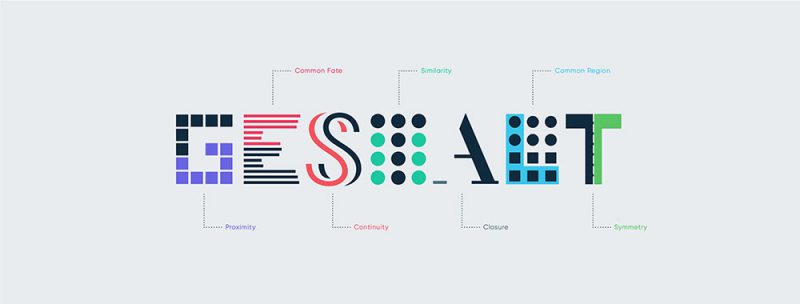
A lot has to do with how a designer uses Gestalt principles. These principles are derived from the Gestalt Rule in perceptual organization, and it states that objects placed close to or close to each other tend to be grouped together. Simply put, our brain can easily associate objects that are close together, better than objects that are far apart. This clustering occurs because humans have a natural tendency to organize and group things together.
Read more Gestalt Principles: An aesthetic measure for designers
3. Color harmony
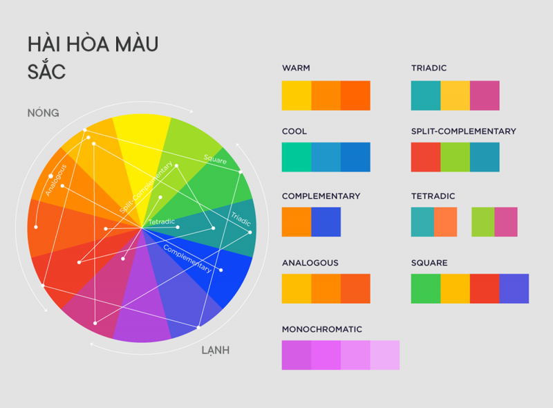
Color harmony (also known as color harmony) is representative of a satisfying balance or unity of colors. The combination of harmonious colors makes the viewer feel comfortable. The human brain distinguishes visual interest and a sense of order created by harmony and creates balance.
Experts have specific ideas based on the principles of “color theory” and “color psychology” that create aesthetically pleasing and pleasing works. The color wheel becomes the designer’s tool to create harmony. Just keep in mind, the “Color Wheel” is a color reference tool, not a color selection tool. Once you have a harmony in mind, you will then use an online device, chip device or online tool that shows hundreds or even thousands of colors you have to choose from. If you don’t understand it yet, we suggest you learn how to mix colors in your design.
4. Font matching
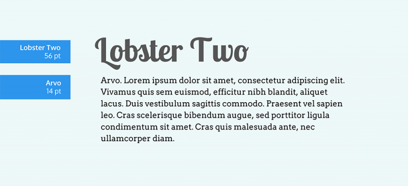
Surely you’ve heard of the rule not to use more than three different fonts in any design. Font pairing is reminiscent of how we match clothes or choose curtains that match the paint color of the walls. They need to support and not overwhelm each other. For example, if you combine a Script font for emphasis and a Sans serif font for additional information, this is a frequently used font pairing.
Never underestimate the power of a font . Along with colors, letters are the first thing viewers see when looking at your design. If you use a unique novelty font, it needs to match the meaning of the message and the rest of the image. Readability is also an important thing that you need to pay attention to, pay attention to whether the text can be seen from a distance.
5. Uniformity

Consider all the elements in a design, such as text, icons, illustrations, shapes, etc. Do they have the right size and color? They need to have a visual unity with each other.
Homogeneity or harmony creates a connection between elements in an appearance. It is the right balance of all elements to create a pleasant whole. The unity is reflected in the harmonious whole. Refers to the unification of all elements in a layout. Where each different part supports the rest. And all that combination makes a homogeneous art block. It is achieved by using continuity and harmony in design. So we have gone through 5 basic principles in design, in the next article we will continue to learn 4 other important principles, you guys keep watching.
6. Alignment and spacing
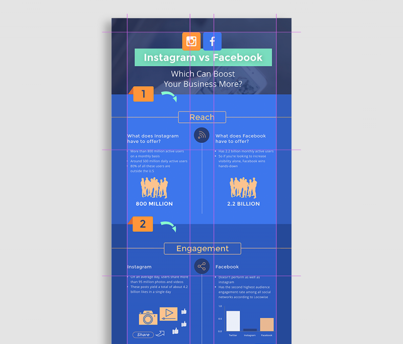
Using a grid helps your design elements stay aligned and balanced. Alignment in graphic design is not a new principle; It is the foundation to create a design that stands out and is attractive to the viewer. Simply put, alignment refers to the arrangement of different design elements in different positions. Alignment makes the design easy to see and understand. No one likes to design with text and graphic elements that distribute clutter and without purpose.
7. Visual balance
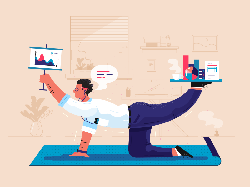
Just like in the physical world, visual balance is important. An unbalanced part can make the viewer feel uncomfortable. Looking back at the second of the three pictures you are seeing – it seems wrong because we can say that the seesaw is definitely not balanced.
Visual weight is a measure of the visual attention of an element or area in a design. When a work is visually balanced, every part of it gets attention. The visual attention is balanced, keeping the viewer engaged with the design.
Without visual balance, viewers may not see all areas of the design. They probably won’t spend time in areas with less weight or attention. Any information in these areas can be easily missed.
8. Focus point and design rhythm

One of the equally important principles in design is determining the focal points and rhythm of the design. The focal point is to grab the viewer’s attention and set the tone for the hierarchy.
You can follow the hierarchical rules of position and size, but it won’t create a rhythm without focus. For example, the title is placed at the top with a large text according to the rules of hierarchy. But the colors are less prominent than the icons. Viewers will immediately look at the icons first instead of the title.
Make sure the important sections in the hierarchy are also in focus. They need to take the viewer on a journey as if they were following a path. The focal point is as the narrator.
9. Color blindness
When designing infographics, you have to remember that some people are color blind. It is not difficult to make your design appealing to color blind users. Just remember these tips: Apply contrast between the foreground and background so they appear visually separate. Use a border to create a bounding box for the text. Stay away from monochromatic palettes with low tonal differences. Don’t match green and red next to each other.
Just remember these tips:
- Apply contrast between the foreground and background so that they appear visually separate.
- Use a border to create a bounding box for the text.
- Stay away from monochromatic palettes with low tonal differences.
- Don’t match green and red next to each other.
Conclude
When Designers understand the design principles above, they can combine the principles together to create designs that are both aesthetically pleasing and highly effective.
Sometimes there will be times when you can’t understand why your design doesn’t look good even after a lot of editing, so reviewing the above guidelines can help you find a better way to solve the problem. .
To become a professional designer, you need to master all 9 principles. You can start a new design following these principles and see how it works.


