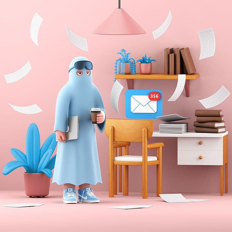
Graphic design styles are constantly being updated and changed, you can see designers are constantly innovating to create new styles or revive old styles but with upgrades New and more modern to adapt to the times.
In today’s article, let’s learn about modern design styles that are being used a lot in recent times. This is also a helpful article for Designers and Clients to help them better understand design styles and possibly make it easier for them to communicate when working together.
Designer : Use this guide to help you better define your design style and get more discovered by your potential clients.
Client : Use this guide to help you describe the idea you want to work on.
3D design style (Realism)
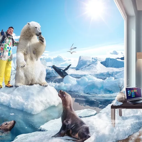
Booming since 2018, although not new, 3D animation and game design is becoming more and more popular. The rise of Augmented Reality and Virtual Reality technology is guiding users with unprecedentedly rich experiences.
In addition, the demand for website graphic design, UI design, network access devices or Internet speed increases rapidly, making 3D design trend more popular than ever.
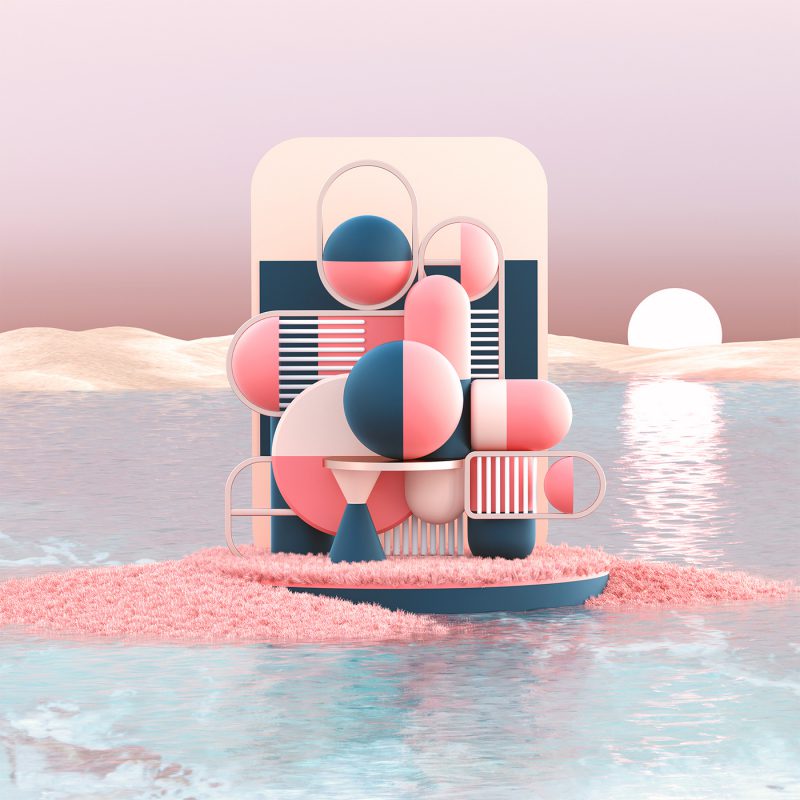
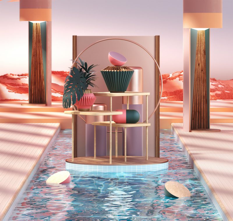
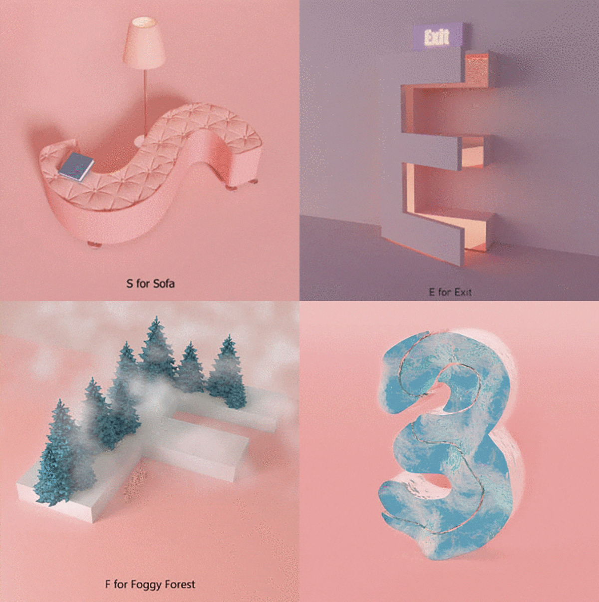
Characteristic:
1. Illustrate the depth, reality
2. Need to understand the brightness of each part of the design
3. Opacity, shadow of the object and color
Combines well with the following design styles:
Abstract, fun, illustrative and masculine
>>> See more 3D Gradient Logo – Impressive, professional and different!
Abstract design style (Abstract)
Lately, we’re seeing designers experiment with organic and geometric elements, focusing more on generalizing ideas rather than depicting them too closely. This seems to be the step that marks the return of the abstract trend in design!
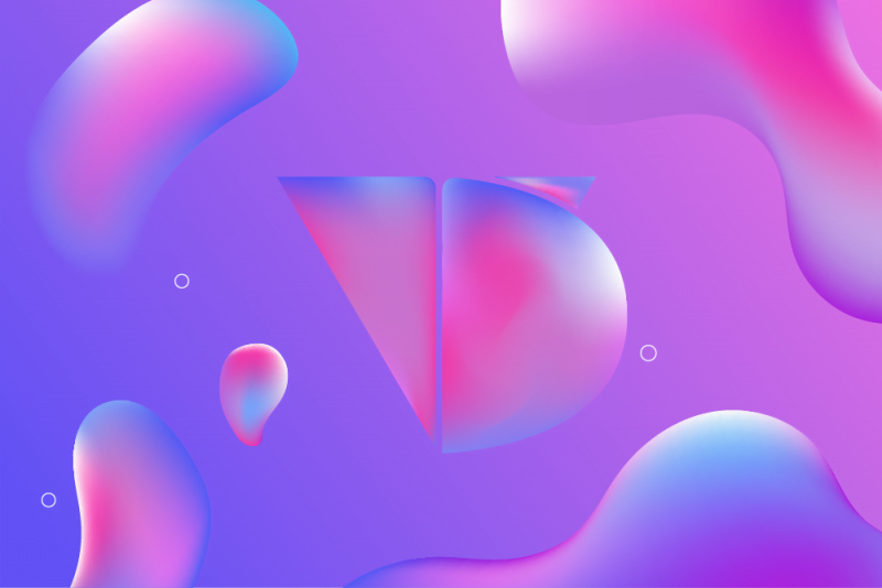
Shapes such as circles, rectangles and polygons have been used in digital product design with great success. They improve the organization of information by adding structure and clarity. In illustrations, they simplify the design, encourage our brain to fly more to add details while highlighting the message in question.
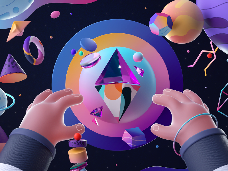
Characteristic:
1. Representing “artistic, abstract” for a specific object or content
2. Expressing personal interpretation of the designer
Combines well with the following design styles :
3D, minimalist, fun, natural, professional,..
>>> See more 7 types of abstract logos (Abstract Logo) to help bring life to the brand
Minimalist design style
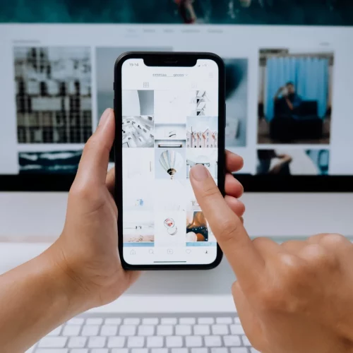
From a design perspective, Minimalist – a minimalist design style that focuses on product features. Not superfluous, every element, from shapes, color palettes, to typography is needed. Simple shapes and lines are always more prominent than complex motifs. That is why simplicity is more valuable than anything else.
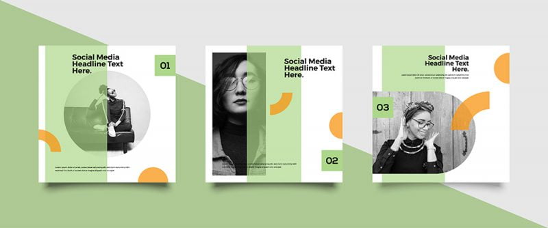
Minimalism took the throne and became the new trend in the modern era, precisely because the human eye and brain only paid a limited attention to the designs. Because of the limited attention span, only a small number of the most striking designs capture the eye of the viewer.
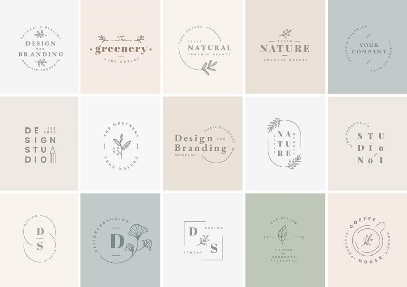
This makes minimalism possible to reach every area of life: from applications, logos, print publications to product packaging designs, there is no design that does not benefit from the trend. save this.
Characteristic
1. Use a small number of colors
2. Use simple, subtle layouts
3. Contrast the abstract style
Combines well with design styles:
Abstract, feminine, flat, geometric, professional and classy.
>>> Learn more about Minimalist Design Trends
Conceptual art design style
Conceptual art is a subgenre of illustration, and is a metaphorical description of a visual idea. Treat it like a fictional illustration, as it doesn’t have to be the same as the real object it’s modeling.
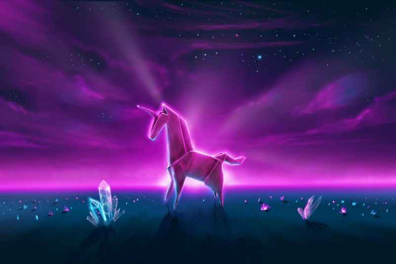
Characteristic
1. Used a lot in animation and games
2. Turns the fuzzy abstract thoughts of the designer into something the viewer can see and understand.
Combines well with design styles:
All
>>> See more Concept Art – All the information beginners need to know
Feminine design style
In contrast to masculine designs, the Feminine style is often characterized by stereotypically feminine details such as soft color palettes, florals, and handwriting.
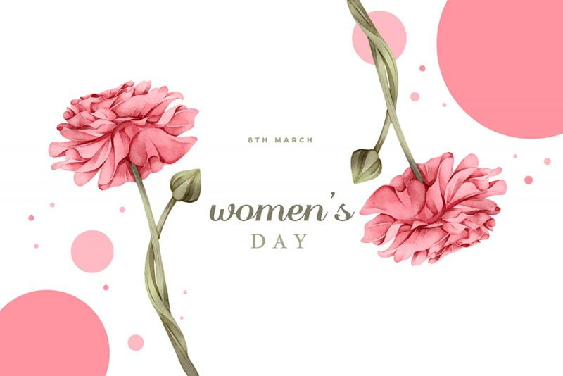
Characteristic:
1. Often combined with winding, stylized, thin fonts.
2. Combine with pastels
3. Wear elements related to women, flowers and fashion products (lipstick, heels, ..)
Combines well with design styles:
Minimalist, flat, illustrative, chic, natural and typographic
>>> Color principles – All the basic knowledge that beginners need to know
Flat design style
Flat Design is a design style that simplifies things. This style removes the element of depth, instead trying to create the illusion of depth of the object through the shading, texture arrangement of the components.
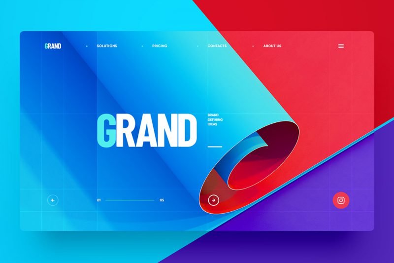
Flat Design focuses on the most basic elements, expressed through the following elements: Expressing the message based on the most minimalist designed icons, the number of colors used is not too much, the colors are concentrated. on brightness and is well-suited for user experience on low-resolution screens.

Today you can see the Flat Design style taking over in UI designs and in illustrations, banners, flyers with a simple yet very modern style.
Characteristic:
1. Use a small number of colors
2. Emphasize simplicity, “less is more”
Combines well with design styles:
Minimalist, feminine, geometric, chic, typograhic, vintage
>>> See more Flat Design concept – Flat design style is popular, easy to apply
Isometric design style
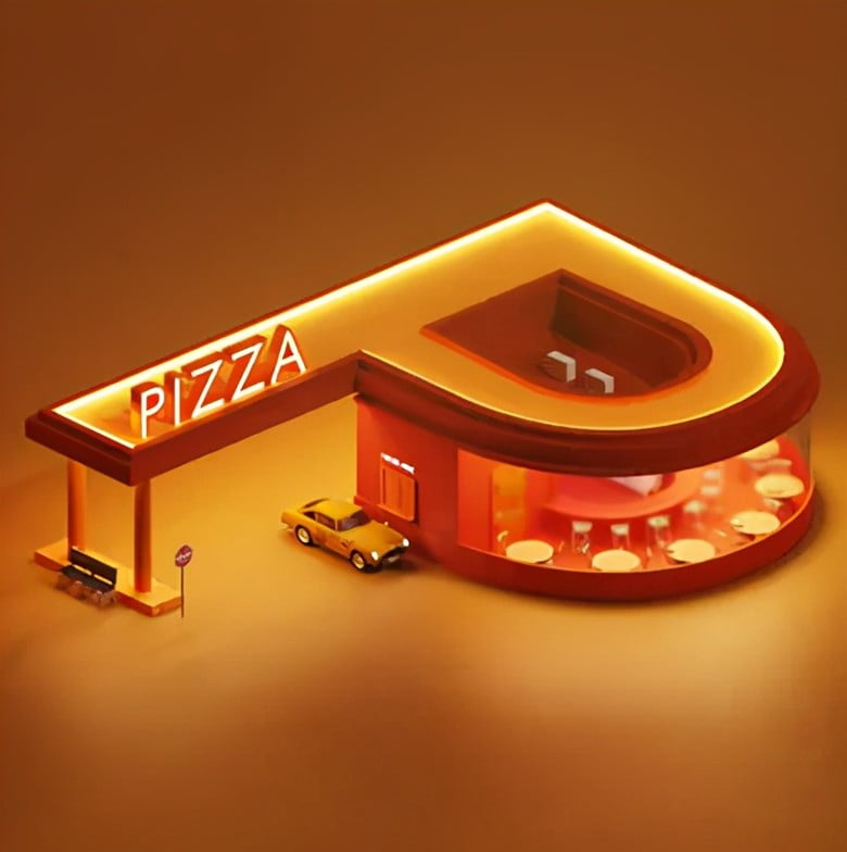
Isometric style is a technique for depicting 3D images on 2D surfaces. This style has been used for many years now but it is only in recent years that it has become popular as designers turn it into something extremely impressive and artistic.
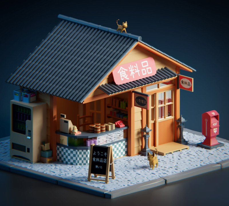
The isometric style is different from the way our eyes see and perceive things. In perspective drawing, for example, the line lines will converge to a point when extended, which is not the case in isometrics where this design style doesn’t have converging lines and everything appears in a fixed direction. . It’s like Isometric is a “product collaboration” between 3D and Flat design.
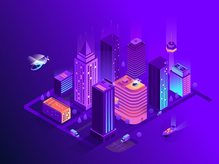
Isometric gives you multiple perspectives, and being able to see the side and top of a design makes people feel excited, wanting to know more about it. Especially for businesses that provide their customers with more options to choose from, where their products or services need to be designed in a way that is as comprehensive as possible, isometric is a perfect visual design metaphor.
Characteristic
1. Use a small number of colors
2. Use simple, elegant layouts
3. Accurate objectivity
Combines well with design styles:
Abstract, flat, geometric, professional and classy.
>>> Learn more about isometric design style
Fun design style
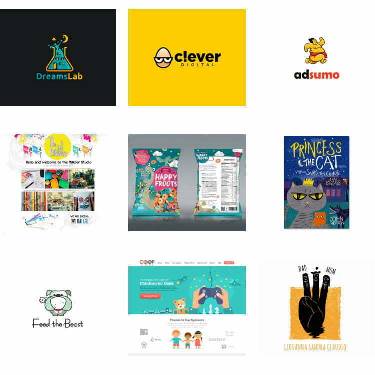
This style gives the day a fresh, dynamic feel, and is easily attracted by its use of color. Usually combined with good animation or illustration elements.
Characteristic:
1. Often combined with animals or people in the form of cartoons
2. Uses lots of eye-catching colors
Combines well with the following design styles:
3D, abstract, illustration, natural, typographic, vintage
Geometric shapes
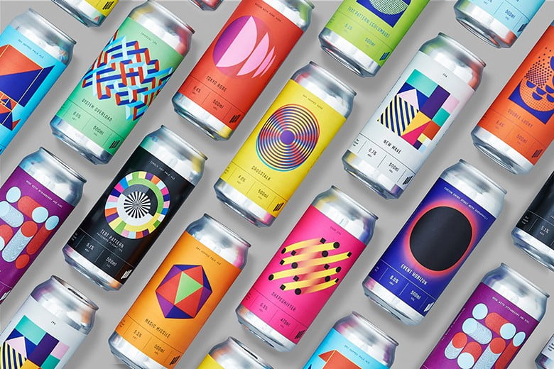
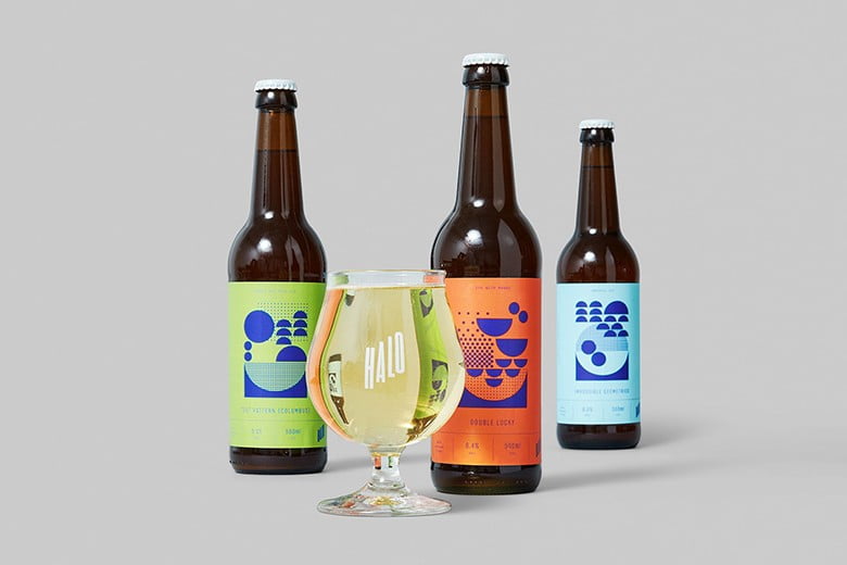
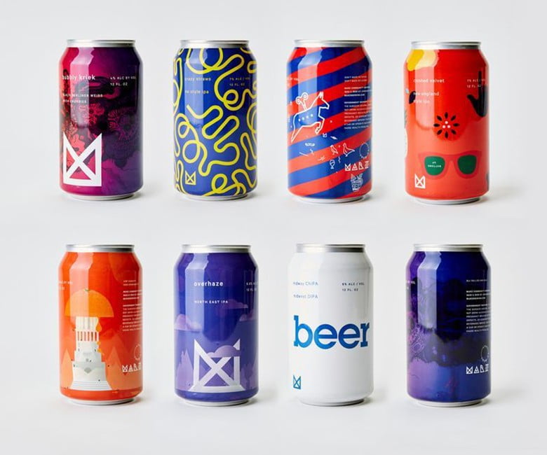
Recently, many graphic designers use geometric patterns, shapes and styles in their logo designs and vector art. Using these geometries, the design becomes a seemingly simple yet utterly striking work of art, conveying influences from the design era of art deco.
Characteristic:
1. Use mostly straight lines
2. Apply symmetry
Combines well with design styles:
Abstract, minimalist, flat, and professional
>>> Meaning and usage of shapes in design
Illustrated design style
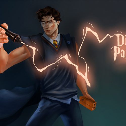
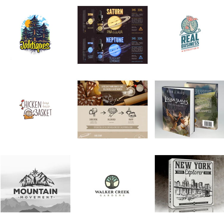
Illustated is the style designers use to illustrate ideas to convey messages. You can easily see them on banners, posters, product packages in supermarkets, or anywhere on the street that you still go home every day.
Characteristic:
1. Completely depends on the designer’s drawing ability
Combines well with the following design styles :
3D, girly, fun, masculine, natural, typographic and vintage
>>> What is Illustration Art? Types of illustrations
Holographic design style
Holographic (or Hologram) is a term used to refer to a 2D surface, but thanks to the combination of color bands, it feels like 3D. Holograms do use some of the popular color ranges of metallic (metallic colors) or sequins (metallic colors) but really all are different. Metallic or sequins have only one color. But the interesting point of holograms is the ability to display differently with different viewing angles.
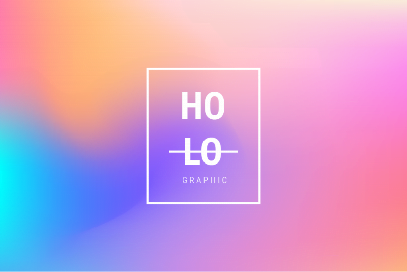
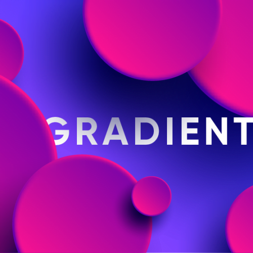
The resurgence of the gradient color trend with creative and flexible color transitions has made Holographic style explosive in recent years. 3D holographic technology is increasingly being applied in the fields of advertising, media and fashion. Many technology companies are also planning to apply this technology to develop screens for electronic devices. This style is minimalist and modern.
Elegant design style
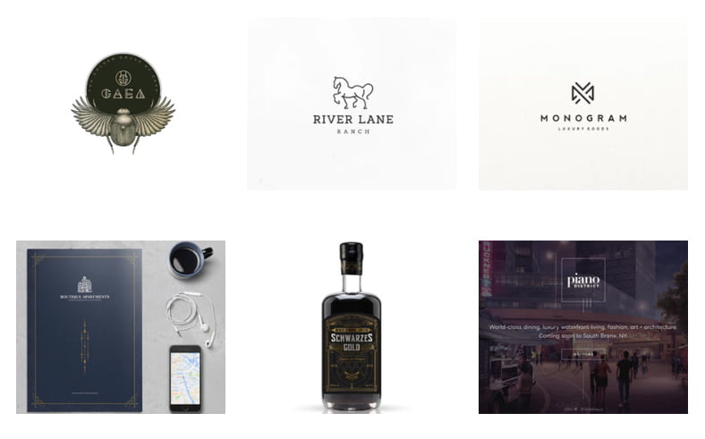
The luxurious design style is used to evoke the emotions of the viewer when looking at the design about the necessary standards of the product. The use of colors such as gold will help the designer achieve the idea of the luxury of the product.
Characteristic:
1. Usually black, gold and bronze are used.
2. Often incorporate minimalist and clean elements in the design
3. Use a variety of fonts from classic to modern
Combines well with design styles:
Minimalist, feminine, flat, masculine, vintage
>>> Luxury Logo: How to Make a Luxury Brand
Masculine design style
The masculine design style is used to attract a male audience. Design details can include simple straight lines, monochromatic themes (black and white), and also details that reflect the man’s personality (strong, rugged, independent, ..)
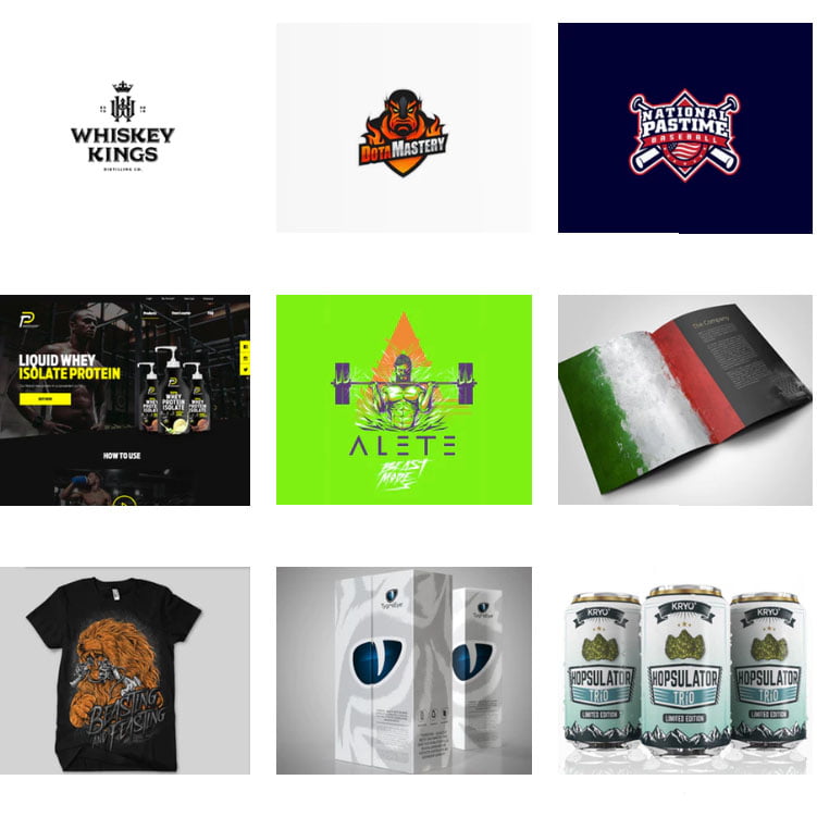
Characteristic:
1. Use thick, bold fonts
2. Use cool, dark colors
Combines well with design styles:
3D, illustration, luxury, vintage
Natural design style (Organic)
This style celebrates our precious planet, in all its organic textures, natural shapes, plants and neutral colors. The graphic design works evoke the feeling of being immersed in nature, which people are aiming for to have a scientific, sustainable and environmentally conscious lifestyle. For these reasons, it is predicted that images inspired by Mother Earth will be one of the top design trends of 2022.
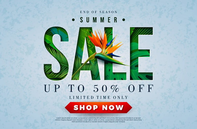
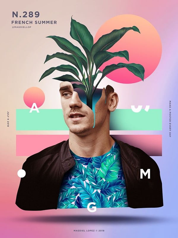
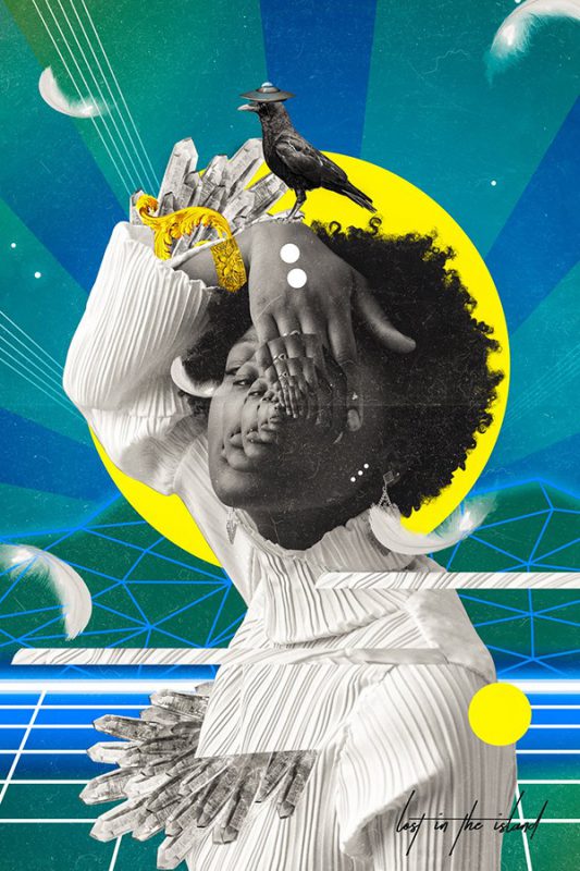
Characteristic:
1. Often combined with natural elements such as leaves, flowers, mountains, soil, trees, etc.
2. Can be combined to illustrate the pure and natural appearance.
Combines well with design styles:
Abstract, girly, fun, illustration, typographic, vintage
Typographic design style
The purpose of typographic design is to find the fonts that best match the brand’s identity, helping to shape the brand in the eyes of the target audience.
Typography (or typography) is everywhere, and whether we admit it or not, we see it in every written document, from newspapers to blogs, advertising, infographics or art.
Nowadays, in the field of television, smart electronic advertising products such as billboards, computer screens, public screens, Kinetics Typography (moving text) are increasingly attracting attention.
2 main reasons why Typography has become a trend, a prominent trend in graphic design and will certainly still be favored in 2023, include:
- Letters can both act as an object of exploitation, easily express information, and at the same time hide the science behind.
- Viewers will experience many different feelings about the message: the work is eye-catching, leading the story through words told.
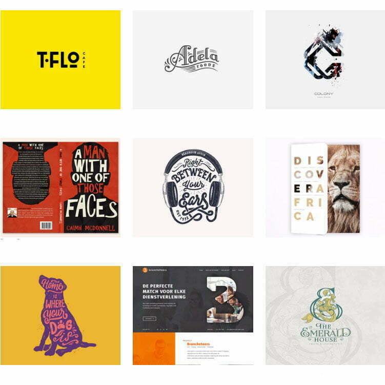
Characteristic
1. Typographic design style focuses on fonts
2. Typographic design can incorporate the use of accompanying objects, but text is still the main element in conveying the message.
Combines well with design styles:
Feminine, flat, fun, illustration, natural, vintage
>>> What is Typography? Things to know about Typography
>>> Beautiful fonts for designers
Vintage design style
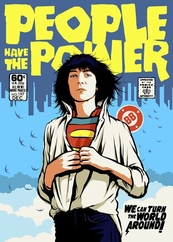
Vintage or retro (short for “retrospective”) is a design style inspired by past trends.
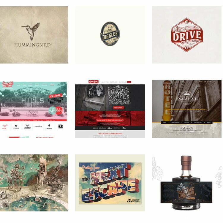
Characteristic
1. Combine rustic, nostalgic elements to evoke the past
Combines well with the following design styles :
Flat, fun, illustration, luxury, natural, masculine, typographic.
>>> Learn about Vintage logo design style
Nostalgic design style
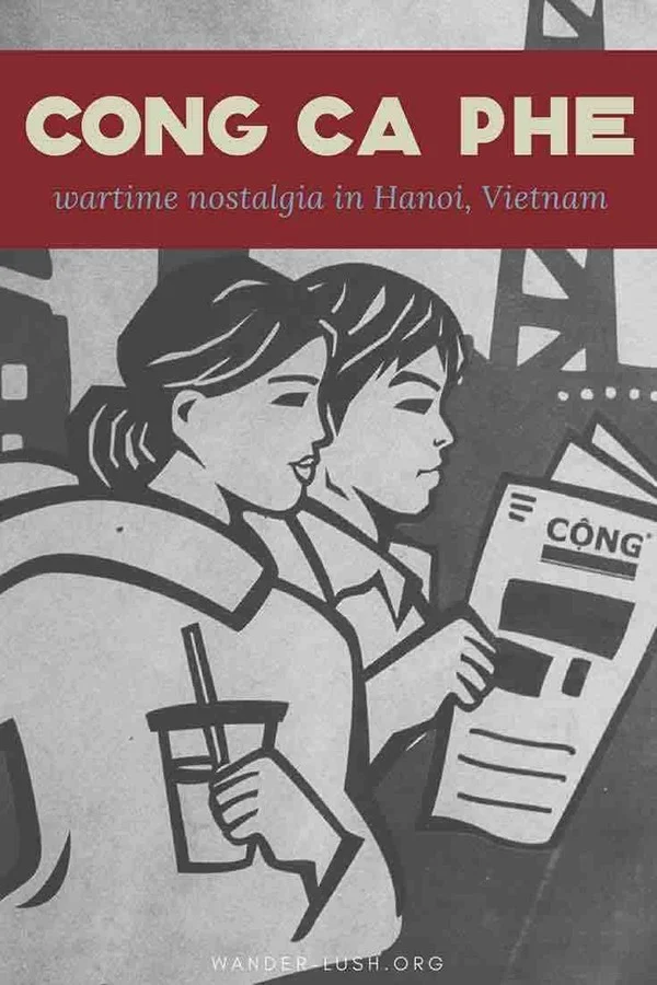
The year 2022 is so unpredictable, many creators reflect with a touch of nostalgia in their designs. Finding inspiration in previous decades is nothing new, and retro design has been popular for a while.
However, 2022 is the year when nostalgic design captures the imagination of designers as the need for comfort, peace of mind and familiarity increases.
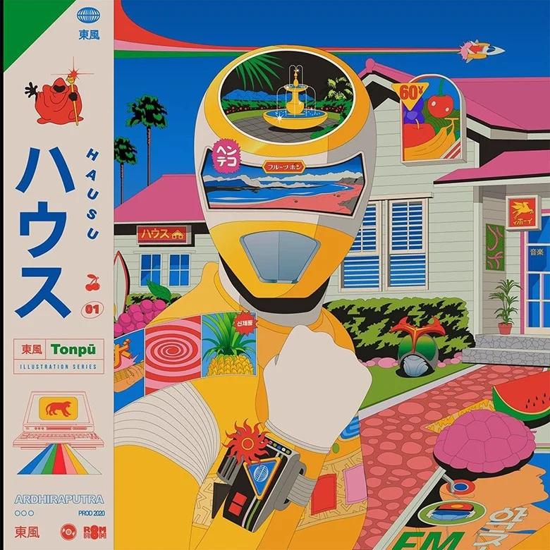
Characteristic
1. Combine rustic, nostalgic elements to evoke the past
Combines well with the following design styles :
Flat, fun, illustration, luxury, natural, masculine, typographic.
End
Above are just the information about graphic design style designers should know. What will happen in the future will remain an unsolved mystery. The world of graphic design is a world that is always undergoing fluctuations by human tastes.

