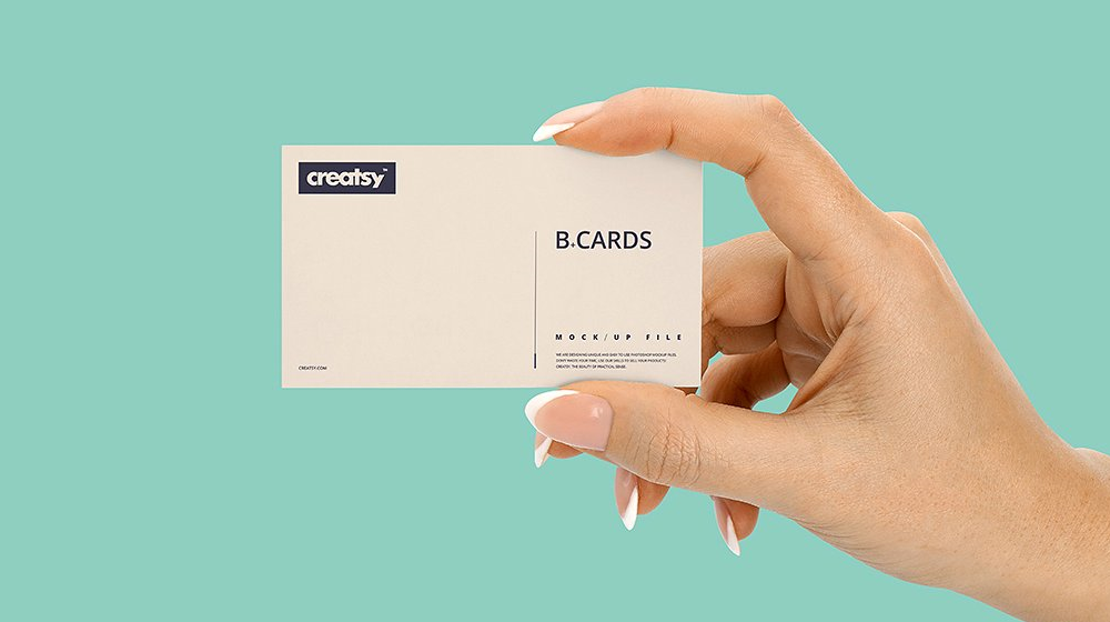
As society develops, personal brands are increasingly invested by people. To serve this need, business cards are gradually becoming inseparable objects, widely used in work in particular and life in general. Used quite commonly like that, but many people still do not understand the value of the name card (visiting card). The following article will provide the issues you need to know about name cards.
What are name cards?
Name card, also known as visiting card, translated into Vietnamese is a business card. It contains all the information you need to know about the owner: Full name, Contact information, Name of the company working, …
Name card (visiting card) supports us a lot, it helps you become more professional and elegant in the eyes of partners and the opposite person. Name cards are exchanged between two parties when meeting, is an easy way to keep contact information, show respect and desire for long-term cooperation.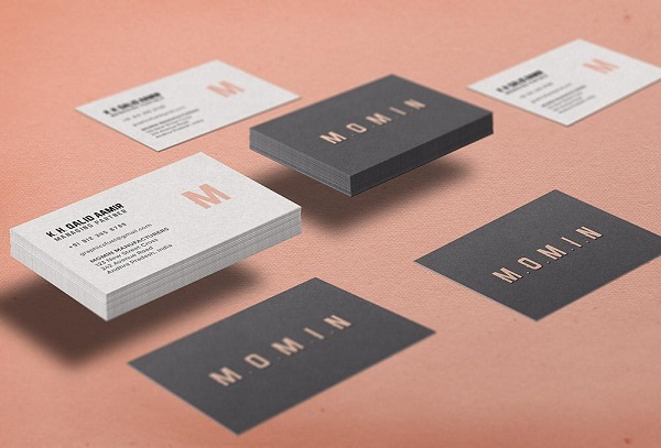
Name card is an indispensable part of the brand identity of every company or business. Also known as a business card. It is often designed to be similar to the brand logo, in accordance with the business field of that brand. Usually each businessman will have his or her own business card.
Information required on the name card
Name card as a way to PR for your business. This publication, besides the purpose of providing personal information, also helps to show the business brand to partners. So the information needed on the name card is:
- Full name and surname . Can print more English name or pseudonym when working
- Current occupation and position
- The unit you are working for : your logo, your workplace address
- Basic contact information : phone number, email, facebook, zalo, … ways people can use when they want to contact you
- You can add your own personal brand image, signature, imprint
Name card design specifications
Name card is usually something you hand over to your partner, therefore, when designing a name card, you need to pay special attention to the issue of simplicity, easy to remember but still ensure the difference, make a strong impression. strong for the opponent.
Design:
The information on the name card needs to be selected, arranged so that it is reasonable and impressive, the content printed on the name card needs to be balanced and harmonious with each other.
You can completely design your own business card if this is within your means. Design is the first and very important step. A good design must provide complete and harmonized information. Unique and creative design will assist you in your goal of creating goodwill with the recipient.
Color:
The next thing to note is the color of the business card, the color imbued with relationships and meanings. We are always interested in something with an eye-catching color. But this does not mean using colorful colors, male cards are only eye-catching when the background color and content are in harmony and support each other.
You can completely use the colors in your business’s brand identity when designing your business card. Color will help you convey your message in the most subtle way.
Notes when printing name cards
Material and print style
Name card shows the professionalism of your personal and business. The material when printed will help the recipient to appreciate this somewhat. Good material will help the recipient feel respected, whereas poor material will make the recipient look less sympathetic.
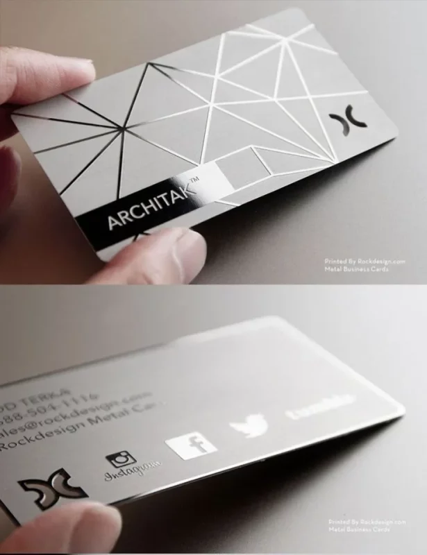
Materials that can be used are paper (Art paper, Couche paper, Bristol paper, …), transparent plastic, wood, metal, …
Similarly, low print style and print quality will negatively affect what you are expecting when using a business card.
Size:
The standard name card size is usually 9cm x 5.4cm = 3.5inch x 2inch. This is the final size after finishing printing and manufacturing.
Usually, business cards printed horizontally will help you present scientific information and have a higher aesthetic. However, you can also print vertically to attract attention.
Beautiful business card design ideas
Let’s dive into some business card inspiration to help you create the perfect business card.
1. Creative business card
Creative business cards have a unique element that makes them stand out from the rest. Here are some ways to make business card ideas more creative:
- Vertical alignment
- Slope
- unique physical shape
- Outstanding color combination
- unique font
- Samples and illustrations
Creative business cards are ideal for industries such as design, advertising, consulting and art. They’re also great for freelancers in these fields!
Remember that your business card needs to be consistent with your brand and represent your business and yourself. So keep legibility and design basics in mind as you explore creative business card ideas.
Outstanding color combination
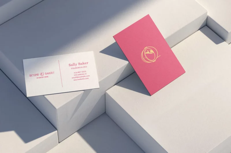
People keep colored business cards 10 times longer than plain white business cards. So pick a palette that makes them more likely to hold onto yours!
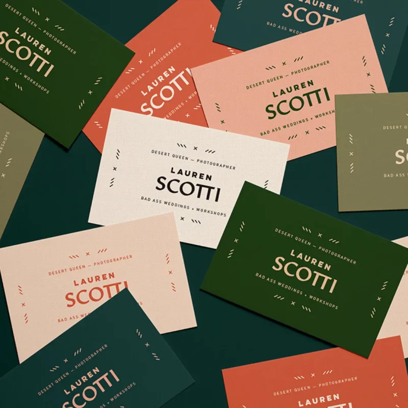
Try striking color combinations like bright pink and yellow or neon green with Pantone’s trendy hues for a different look. Make sure the colors match your brand personality and don’t resemble your competitors.
Samples and illustrations
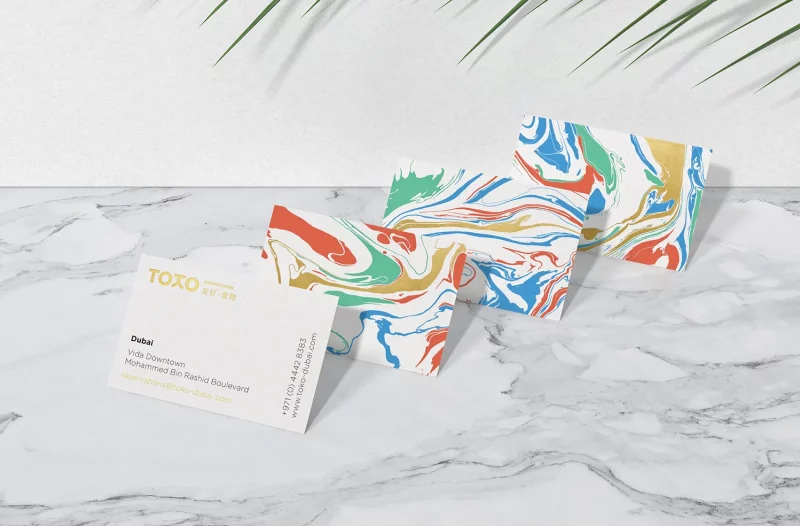
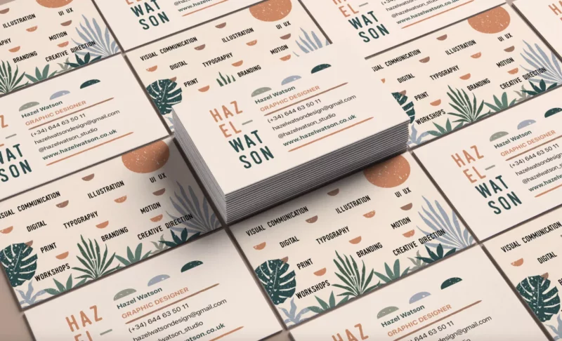
Most business cards are scrapped within the first week, so aim for a business card design that’s beautiful enough to hold, but bold enough to inspire action. Try using handmade illustrations or unique patterns to grab your customers’ attention.
Look for a fun serif or display font, or try using font color variations to add a creative angle. Like the business card ideas above, a unique font color combination can say a lot about your business!
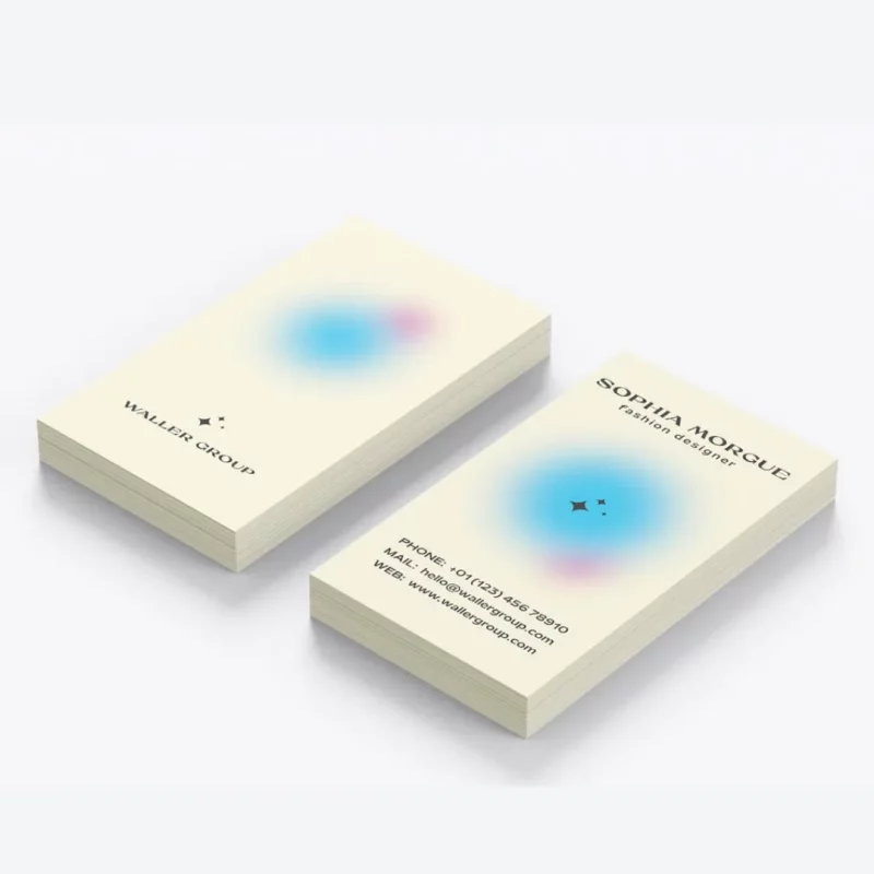
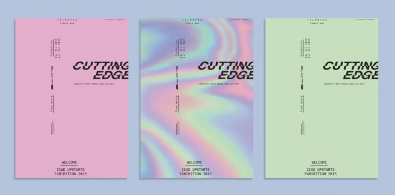
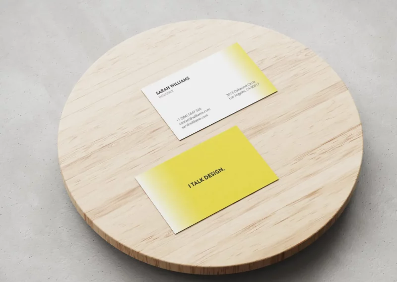
Gradient and Blur
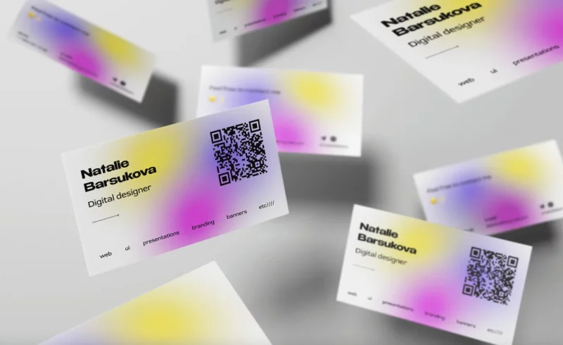
Blurs and gradients are graphic design trends this year! Keep up with these trends to give your business card designs and website designs a polished, modern, and believable appeal. It will impress your customers and give you an edge over your competition!
Plus – gradients and blur effects add a dreamy and glamorous look to your business card design.
Unique physical shape
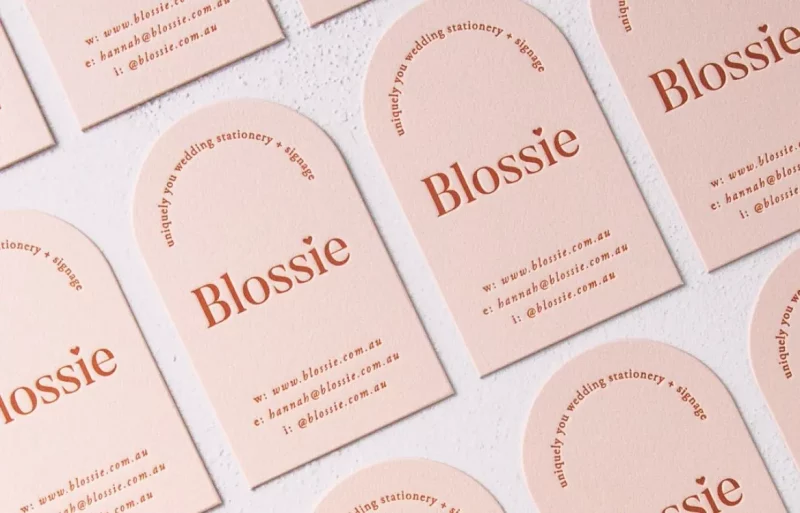
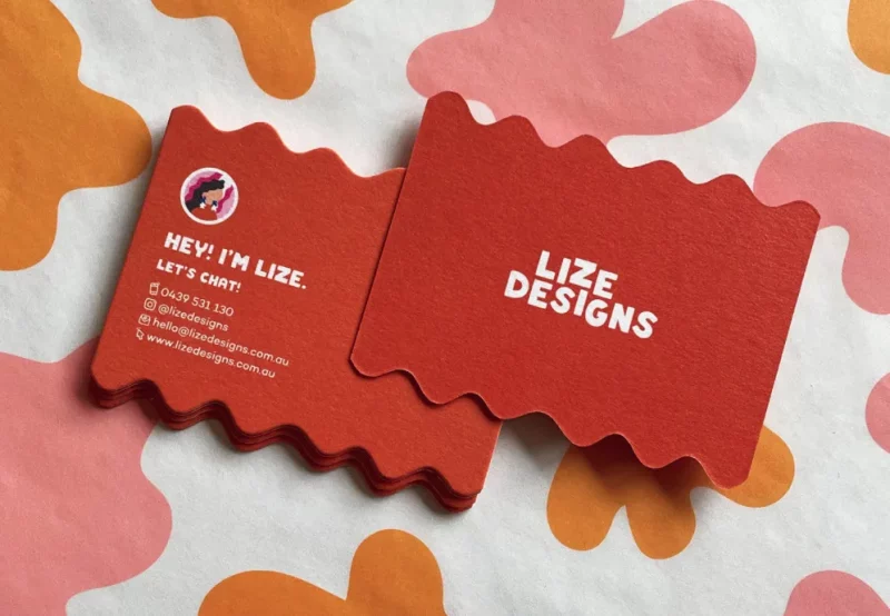
Some business card designs get creative by changing the physical shape or material of the business card. Try creating a clear cut or rounded edges of your business card. Or, use recycled materials to make your small business more sustainable. This can earn you bonus points with climate conscious customers!
Above, the Blossie business card inspiration features a softly rounded vertical side, while the Lize Designs business card features wavy cross-sections. Both use shapes to accentuate their business card designs!
2. Modern business card
Modern business cards are modern, sharp and professional. Here are a few ways to make your business card ideas modern:
- Pictures and portraits
- Monochrome color
- Embossing
- Braille
- Floral motifs
A modern business card represents a forward-thinking brand that values professionalism and efficiency. They are ideal for industries such as accounting, law, architecture, construction or consulting.
Pictures and portraits
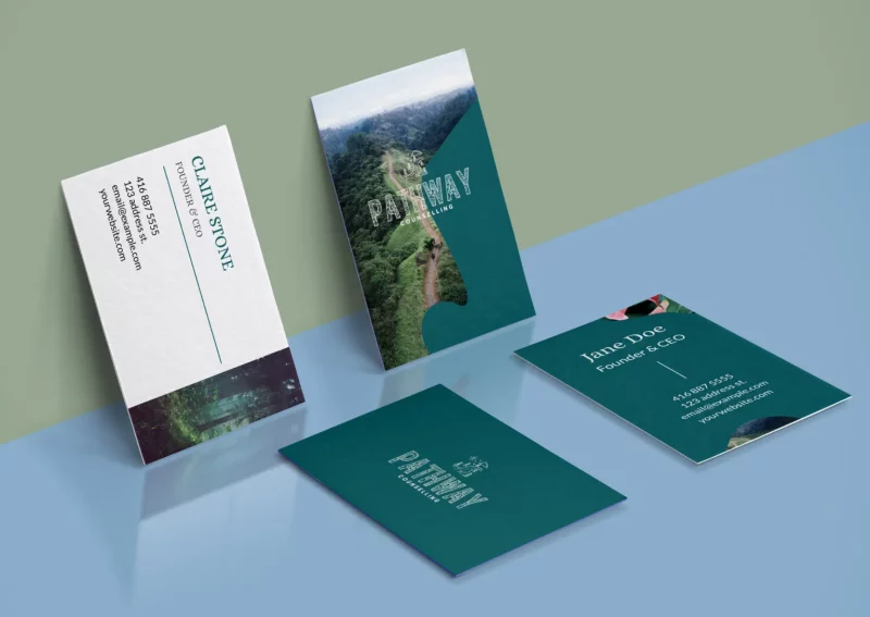
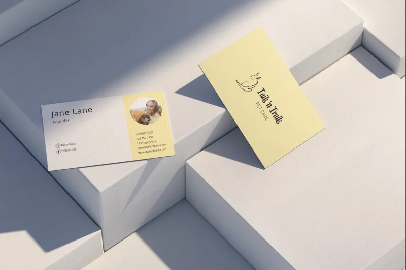
Add your own image or portrait to create a more dynamic and personalized business card.
This helps people remember you and is especially helpful if you work directly with customers. This style works well for industries that need a more personal connection, like childcare, dog walking, teaching, and training.
Monochromatic colors and modern fonts
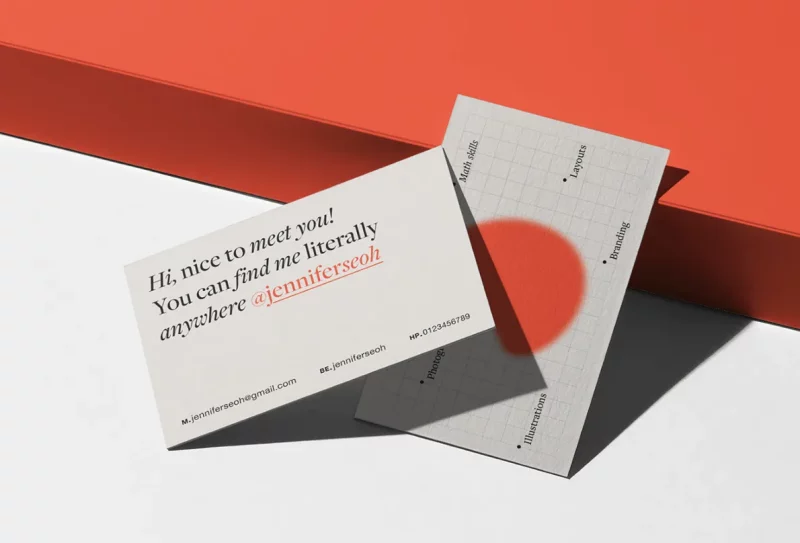
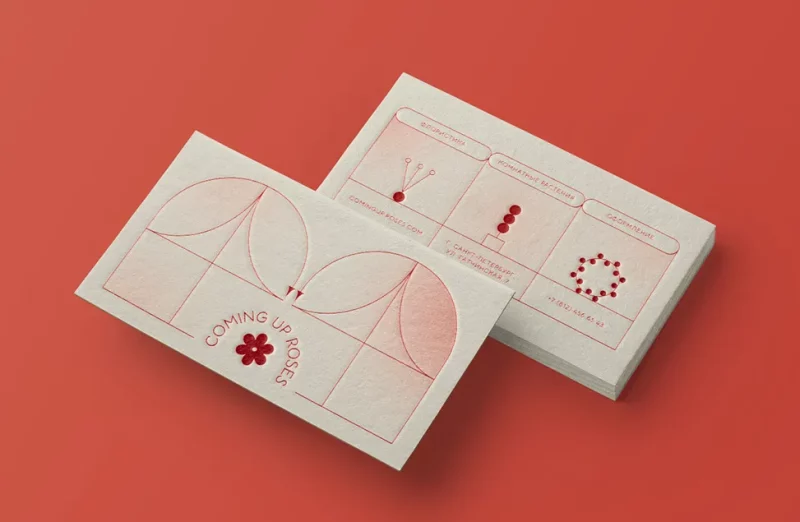
Try using a simple monochrome palette for a modern look. Like the business card inspiration above, spice it up with unique fonts, shapes, or templates to communicate your services and brand.
Choose a modern font or a sans serif font for a sharp appeal and choose a color scheme that showcases your brand, but differentiates you from your competitors.
Embossed or raised
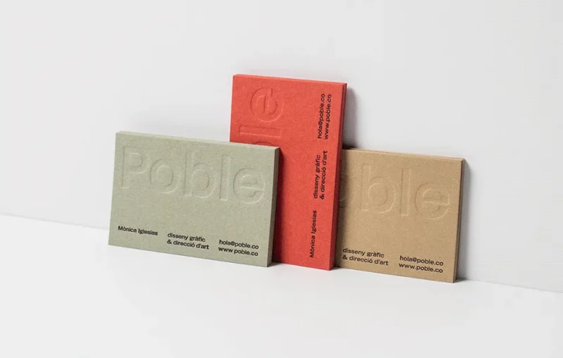
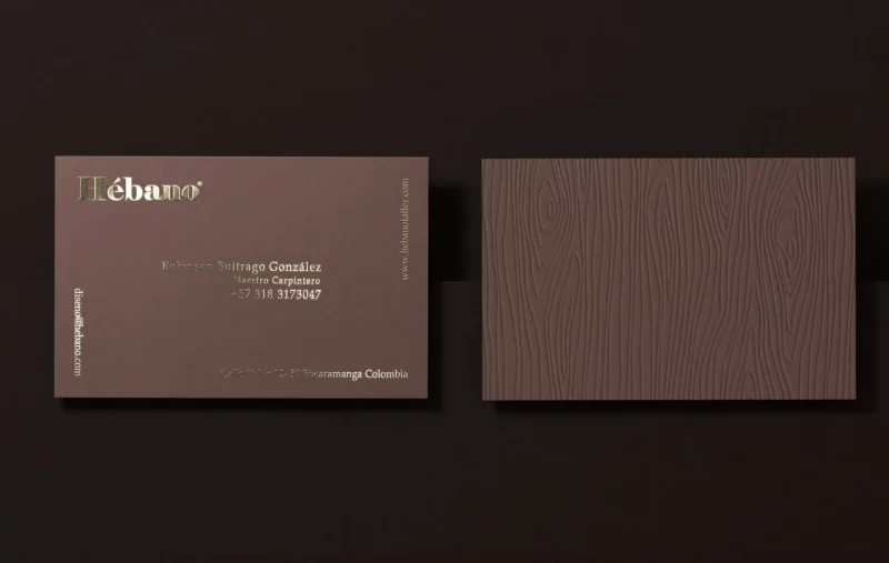
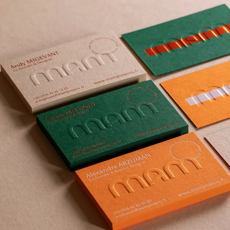
More than just writing in ink and braille or coloring can give your business card designs a modern, high-quality look. Like the first example, having a bold color palette with an embossed logo shows professionalism and quality.
The business card idea above uses a raised wood-like pattern to add texture. Chocolate with golden leaf combination creates a luxurious and different feeling. Having vertical text also adds appeal!
3. Classic business card
Whether you’re selling vintage clothing or natural skin care products, retro style always has its appeal. This style is suitable for industries with history or tradition, so here are some ways to design a classic business card:
- Handwritten or serif font
- Grain texture
- Craft Icons
- Retro color combinations
- Decorative elements
Use classic font and color combinations to create vintage charm, and get inspired by Soultrain, That 70’s show, or vintage movies to inspire your designs.
Retro color combinations
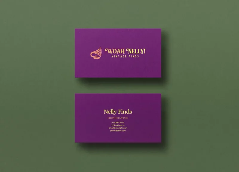
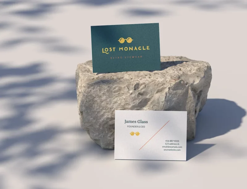
Try classic palettes of lilac and cobalt, and complement them with mustard or pumpkin. Soft and cool pastel colors are also reminiscent of days gone by, but add grainy textures for a vintage effect!
Handwritten or serif font
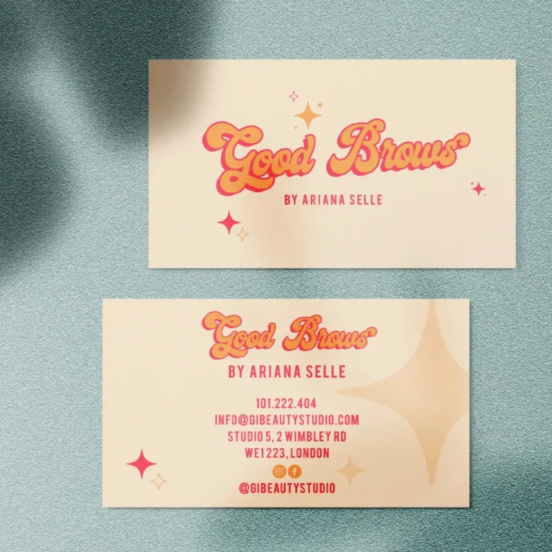
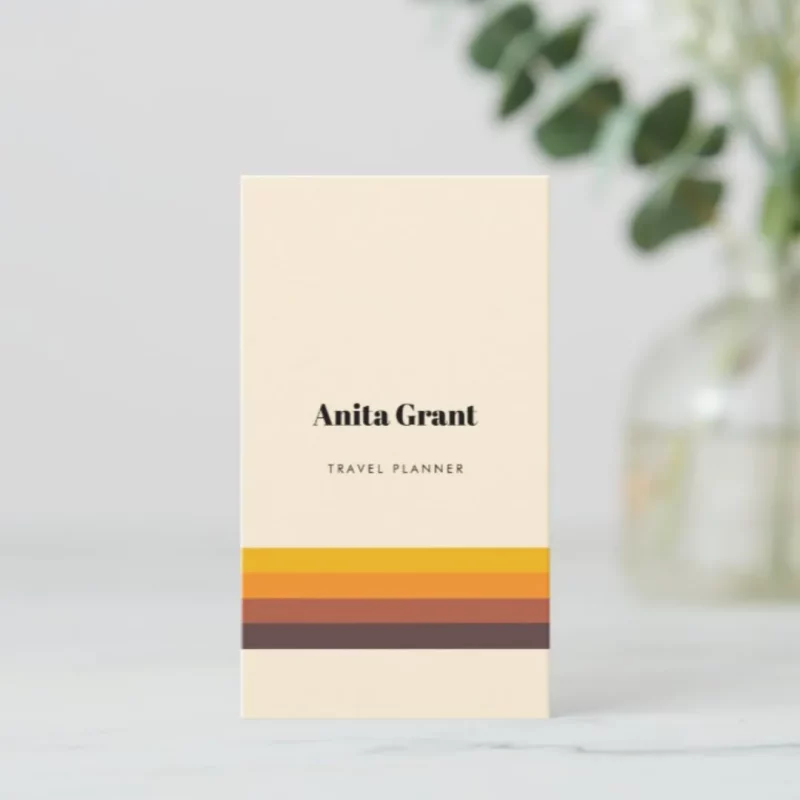
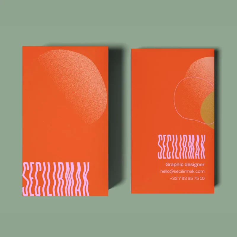
Styling a serif or handwritten font with a classic color combination can instantly bring your brand back to the old days. The business card inspiration above uses a catchy display font that has a fun ’70s appeal, while the minimal vintage business card design is more subtle.
Decorative elements and icons
Decorative reels, swirls and containers can all add a handcrafted charm to your business card idea design. Play around with handcrafted patterns, cabinets, and icons for a vintage appeal that alludes to a nostalgic era.
4. Minimalist Business Cards
The clean appeal of a minimalist business card can be sharp and inviting. These designs are direct, confident and unpretentious. They are best suited for consulting, coaching, consulting and functional design. Here’s how to make your business card design minimalist:
- Simple color palette
- Minimalist logo
- space
- Basic layout and composition
All you need are the essentials and a deep understanding of your brand identity. The key here is to do the most with the fewest elements.
Simple color palette
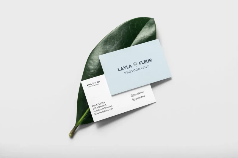
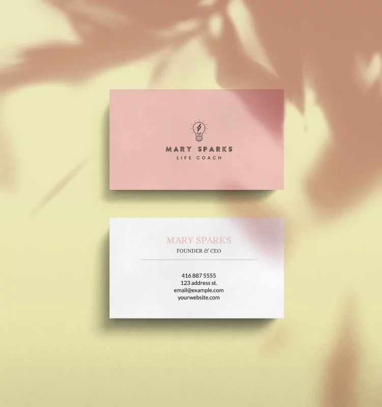
Stick to a simple color palette and choose an accent color to make up for the gaps and black text. Also, avoid adding more than one accent color, it will detract from your minimalist design.
Minimalist logo
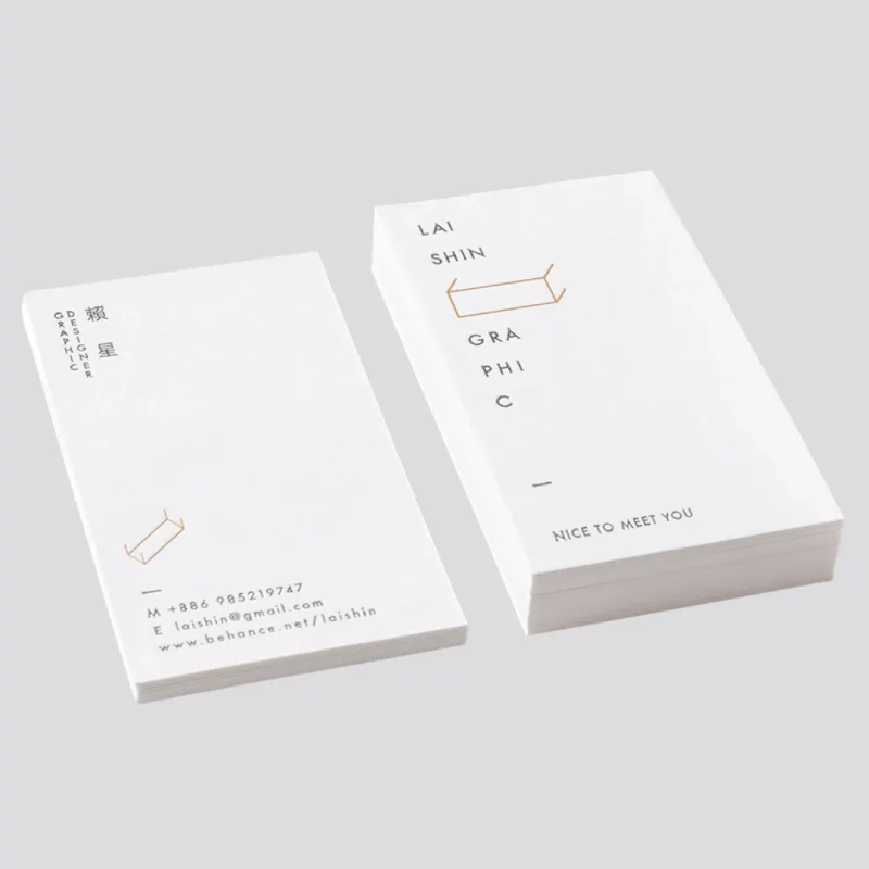
- SOURCE: LAI SHIN ON BEHANCE
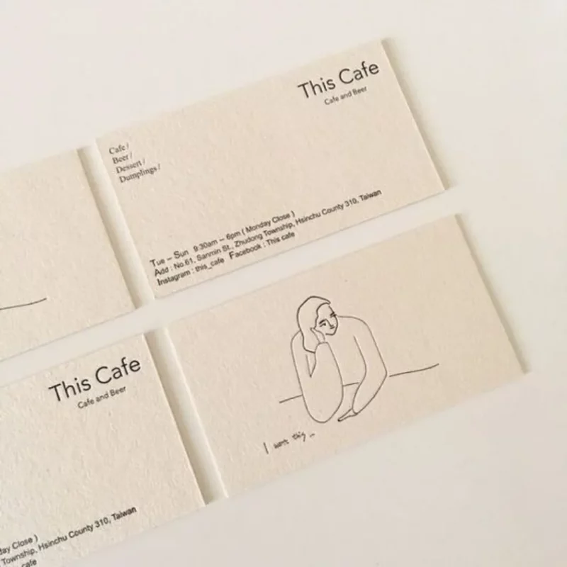
- SOURCE: PINTEREST
If you opt for a traditional black and white color scheme, create interest by adding a freehand illustration to the front of your business card. Or, you can play around with the text layout and break the words up into vowels like the business card on the left.
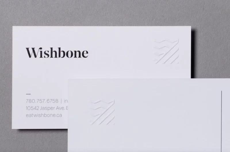
5. Vertical business cards
While some use colors, fonts, and layout to grab the recipient’s attention, vertical business cards use perspective. Here’s how to style a vertical business card:
- Multi-angle copy
- Bold and embossed colors
- Illustrations and
These business cards are unique and work well for creative industries like design, architecture, brand consulting, advertising and personal branding .
Multi-angle illustration and reproduction
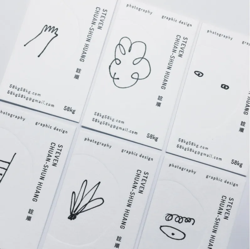
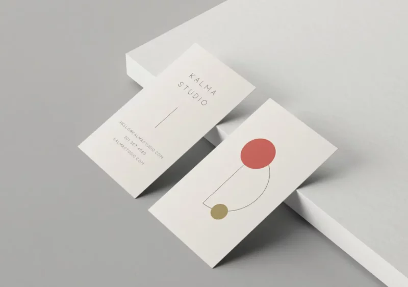
Modern doodles and illustrations can add mystery when left alone on the front of a business card. You can’t help but flip it out out of curiosity! The business card inspiration above uses both elements to create a sense of personalization and exclusivity.
Bold and embossed colors
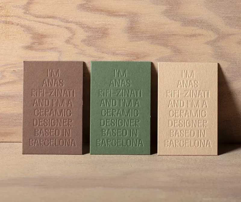
The above example uses only color and embossing to promote their brand and business. It uses unique alignment and vertical orientation to shine in the competition and make a statement.
Try adding colorful blurs, bold backgrounds, and hallucinogenic text if it suits your brand. Vertical business cards are not for secure design. Be creative and use the rules of visual hierarchy to maintain clarity and aesthetics.
Epilogue
The above is a summary of important information that needs to be understood before printing and using name cards. Customers can refer to it to make the most accurate choice, avoiding printing errors.

