Pink is often considered a gentle, feminine color and is for the weaker sex. In fact, quite a few logos use pink.
However, pink is much more versatile and powerful than we think, it also has many different meanings that can make your brand stand out. Pink is a sweet combination of the passion and energy of red with the purity of white.
Exploring the meaning of pink and how it can be used with different design elements and industries will give you a better idea when looking for a color that matches your logo.
Mục lục bài viết
ToggleThe meaning behind the pink logo
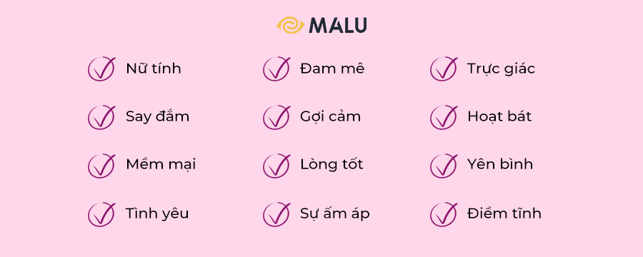
Color association strongly depends on culture, personal experience and upbringing – the meaning of color.
For example, in Western cultures, pink is considered by many to be feminine, romantic, and soft. In Korea, pink symbolizes trust. While in Japan, pink represents spring, youth and good health.
Some examples of pink logos:
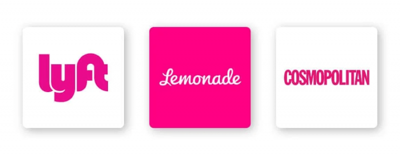
However, pink is often considered a color that symbolizes sweetness, warmth, love, softness, femininity, and playfulness. Brands often use pink logos to represent these traits, such as Cosmopolitan and Lemonade. The insurance company chose a bright pink logo to represent a boring theme and make it more interesting.
Pink is also a color that represents friendship, harmony, and closeness. Just take Lyft’s pink icon as an example. The company has used a bright pink logo with the aim of making women feel comfortable when stepping into their cars.
How to combine pink with other logo design elements
When it comes to pink logos, besides a few design elements that can go well with this color, there are also many elements that don’t.
Typography
Choosing the right font for your logo will help you build a stronger brand identity. Combining fonts with pink can be the key to differentiating your logo.
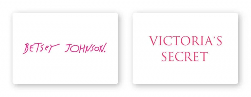
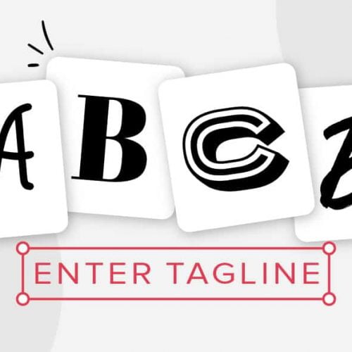
There are 5 main types of fonts, each of which will express its own personality:
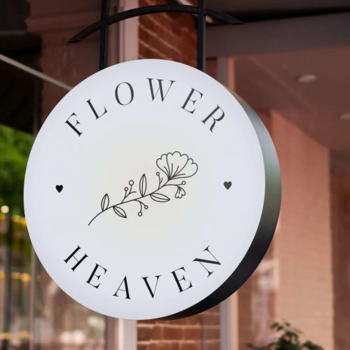
Serif – Popular with companies looking to showcase a sophisticated, luxury brand, such as Victoria’s Secret.
Sans-serif – Easy to read and simple, this is a pretty popular choice with startups or tech professionals.
Slab serif – A bold slab serif font commonly used by tech and car companies.
Script – Great for businesses that want to exude elegance and add a personal touch, such as photographers, coaches or any family-owned brands. Script is a font that combines quite well with pink.
Decorative – Big, fun and entertaining, these fonts mix well with the pink color of Betsy Johnson’s logo.
Of course these are just general rules, but by no means are they limited by those rules. Feel free to mix and match pink with different fonts to match your brand.
Shapes and symbols
In your logo design, different shapes can help create a psychological and emotional connection between the brand and the consumer. It’s important to understand what each shape says about your brand and how you can effectively incorporate them into your design.
Circles often represent femininity, symbolizing stability and cooperation. The ring logo is designed for the user to focus on the message of unity.
Circle logos are also considered a symbol of continuity and perseverance, as they are often used to associate with time or planets, sun/moon.
Think of using a circle in your pink logo design to send messages of unity, harmony, friendliness and more.
Is the pink logo for you?
Like I mentioned before, color is subjective and there is no way to tell if its use in a logo is right or wrong.
That said, you can absolutely use pink if you feel it fits one of your brand messages or values. Or, you can use pink to set yourself apart from your competitors’ logos.
If your brand is in one of the following industries, here are a few good ideas for how to use pink:


Pink logo for personal branding
While pink is often designed to look as bright and eye-catching as possible, don’t overlook its soft and light side. By using light pink tones, personal branding can convey a lot of different meanings.
Pink logo for beauty brand
From nail salons to makeup artists, pink is always the perfect choice for beauty brands. Pink has a strong association with brands for the majority of female customers. That’s why any shade of pink can be chosen as the color that represents a beauty brand.
Real estate pink logo
Most real estate logos have white text on a solid color background, usually blue and gray.
However, in a competitive space like the real estate industry, you want your logo to stand out, then choosing pink as the main color is entirely possible. Feel free to mix different fonts with pink. Your logo can convey a sense of trustworthiness, approachability, and composure to your customers and make them feel more comfortable.
Pink logo in wedding branding
We find that pink is always the ideal color to express elegance and femininity, this is especially true for bridal brands. Often softer pink palettes are more suitable for this area. In fact, combining pink with soft fonts will make them more accessible to your customers.
For an attractive and versatile look, you can’t go wrong with tones (it’s best not to use more than 2 or 3 colors in your design —less is more).
Pink logo about health
When someone says they are “in good shape” it means they are in good health. So, naturally, pink would be extremely suitable to appear in a symbol of health.
Pink is known to have a calming effect. With its presence, it will be difficult for the user not to smile with a blushing face.
Pink logo in technology
The tech industry has always been tough to compete with, and tech companies need to separate themselves from the crowd more quickly than ever before. If you’re looking for a way to let your customers know why your software or service is the best there is, then of course pink is also an out-of-the-ordinary choice.
The color of your logo is what sets you apart from your competitors. In case your biggest competitors are already using masculine colors like blue or black, you might be better off switching to more striking colors like pink.
Color combination with pink
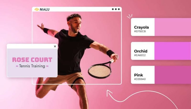
Pink can be quite versatile in terms of color scheme depending on the color you combine it with. Take a look at some examples of color combinations in a pink logo:
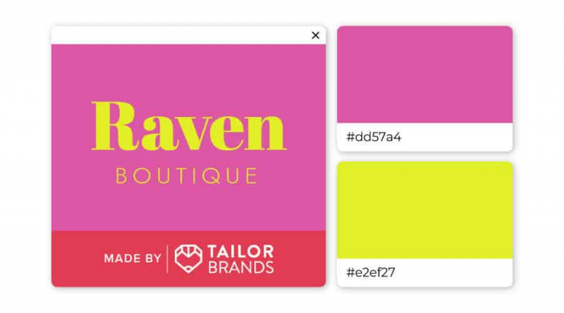
If you want your logo to be associated with cheerfulness and optimism, then yellow and pink are the right choices.
Neon yellow has the advantage of being youthful and bold, while a stable pink will help balance all of the above.
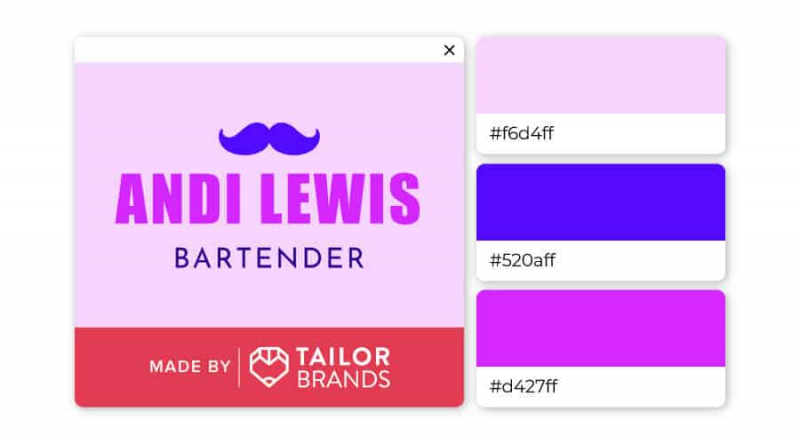
The two contrasting shades of pink complement each other, while the electric blue serves to highlight the entire design of the logo. Choosing this color combination is quite bold, but it clearly shows elegance, creativity and style.
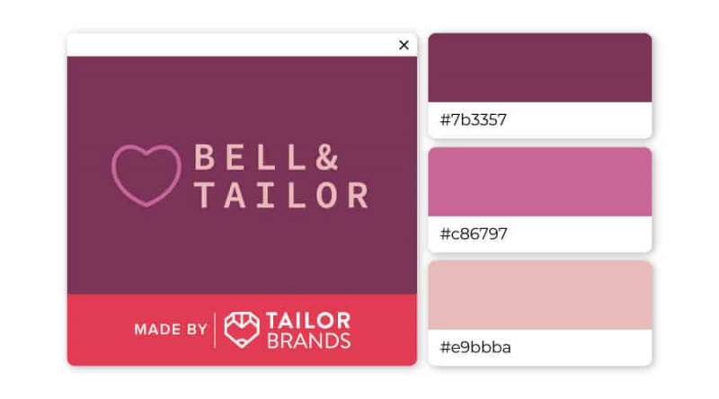
With a range of colors from pink purple to nude pink, this trio is different enough to add a unique touch to the logo, while still creating a soft and comfortable feel for the user.
You can learn more about how color psychology affects people when you’re ready to design your own logo.
For you
Pink always conveys femininity, elegance, and playfulness, but combining it with other colors or custom fonts can create many unique designs that you don’t expect.
If you are considering pink as the main color for your brand logo, contact Malu Design for logo design !

If you are looking for a reputable and experienced unit to be able to design a professional and impressive logo and brand identity system , then please contact us immediately by phone. 0988 622 991, or leave your information and requirements, Malu Design ‘s consulting department will contact you right away to answer all your questions!
————————
Malu Design – Branding Identity Agency
Hotline: 0988 622 991

