“Just do it.”
“Think different.”
“What happens in Vegas stays in Vegas.”
Do you feel familiar when you see these slogans? Chances are that they have occasionally popped into your head unconsciously, you even refer to them or occasionally quote them to relatives and friends.
That’s the power of slogans: They stick in people’s minds and become as iconic a brand feature as a logo. A great slogan goes viral and is a powerful tool for building brand awareness .
While not every successful business has a unique slogan, developing a catchy and memorable slogan is an effective way to market your brand.
What is a slogan?
A tagline (also known as a slogan or tagline) is a tagline that communicates more information about your product, service, or brand. A tagline can be a clear representation of what you offer or be used to evoke emotions associated with your brand. For example, “Wedding photographer” or “Just do it”.

We see and hear slogans everywhere; in advertising, radio advertising, packaging, digital advertising and sometimes in logos.
If you’re designing a logo for your business and trying to figure out if a slogan should be included, there are a few things to consider. More often than not, a logo slogan can detract from the value of a logo unless it is done right – that’s why we decided to write this blog!
Do’s and Don’ts when using Slogan
Below, we’ll go over the do’s and don’ts before you jump into the logo slogan group, along with some helpful examples.
1. Do: make your logo slogan descriptive or emotional
The best slogans will tell you a little more about the product or service offered or make you feel something.
To answer these questions, you may want to sit back and assess what sets your brand apart from your competitors and others in similar markets.
If there is something unique or different about your product or service, you may want to use your slogan to indicate this. If your personality and brand values distinguish you from others, you may want to go the emotional route.
Deciding this will help you choose the right words to use. You want to be careful not to be too descriptive. Logo slogan means a little mystery and makes a person want more.
Take these examples:
Examples of descriptive slogans
Goldfish’s slogan “The Snack that Smiles back” is both descriptive of the actual product and emotional. The implication is a happy snacking experience, where both the snack eater and the snack piece smile.

Subway’s “Eat Fresh” slogan, while controversial for its brief description of the (questionable) healthy nature of subway sandwiches.

Examples of emotional slogans
Adidas’ slogan, ” Impossible is nothing” evokes an emotional response to power and self-determination. The ability to overcome obstacles and face challenges is the message Adidas wants to attach to their brand.
L’Oreal’s slogan, “Because You’re Worth It”, implies that buying their products and using makeup is a quasi-treat to yourself. It is based on a core psychological principle that it is necessary to be “deserving” or “sufficient” in order to validate doing something.
In recent years, many companies have moved from clear, descriptive slogans to much more mysterious, sensationalist slogans. Take Fedex as an example.

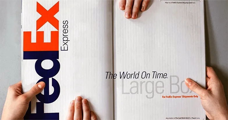
FedEx’s newest slogan, “on-time world,” still conveys the same sense of prompt delivery as its original slogan without being overly wordy. Ideally, your logo slogan highlights a key benefit, while still leaving something for the imagination.
2. No: choose a slogan that is too long
Great logo slogans are usually short, (about 4 words or less) and grab attention with humor or some other creative hook.
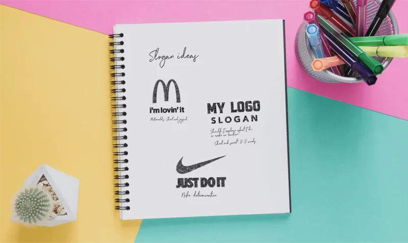
Nike and McDonald’s have two of the most memorable logo slogans out there.

It is no coincidence that they are three words long. The fact is, these catchy slogans are short and, therefore, easy to remember. They don’t necessarily tell you anything about what the company does, but they do evoke strong emotions. In the case of McDonald’s, it’s a feeling of comfort and fun. In Nike’s case, it’s a sense of determination and action.
But there’s another reason these slogans are so memorable, a more practical one. Shorter slogans are simply easier to work with.
The three letters can easily fit underneath the logo without detracting from the logo design. From a design perspective, they can really help balance a logo. Longer logo slogans can unbalance the design and make the logo less impactful and harder to read.
If you are thinking of using a logo slogan, try to think of something simple and use as few words as possible. Avoid being verbose and cramming a lot of ideas into one sentence. If you’re having a hard time keeping your slogan short, you should avoid including it in your logo — save it for other marketing materials!
3. Do: consider the locations where the slogan is used
This leads us to an important consideration. If your logo slogan doesn’t work, don’t worry! There are plenty of opportunities to use slogans that aren’t directly in your logo.
Other worthwhile places to put your logo include:
- Site navigation bar or footer
- Business card
- Printed marketing materials such as flyers, posters and coupons
- retail store front
- voicemail
- company clothes
- digital advertising
- tinkling company
- Company promotional items such as notebooks, pens and water bottles
Your slogan can actually resonate better and have more impact if it is placed somewhere other than your logo .
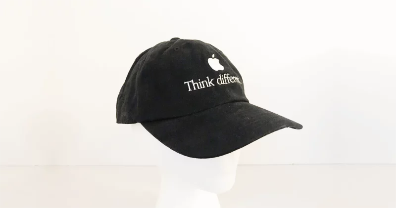
Let’s say you run a small restaurant or coffee shop, if your employees wear t-shirts or hats with your slogan printed on it, this will probably leave a stronger impression because your customers are interacting. with them every day.
4. Do: be careful with font pairs
Choosing a font for your logo slogan is an important step. You’ll want to make sure you’re using the right font pairs so as not to complicate the look and feel of the logo. You don’t want to distract from your company name!
A few rules of thumb to keep in mind are:
- Keep your slogan font simple
- Avoid fonts with script and use sans serif or serif fonts instead
- Keep the same font family for both your company name and slogan, but reduce the weight of the slogan
All these logo design rules help to convey hierarchy, which in turn helps the eye know what to look at first.


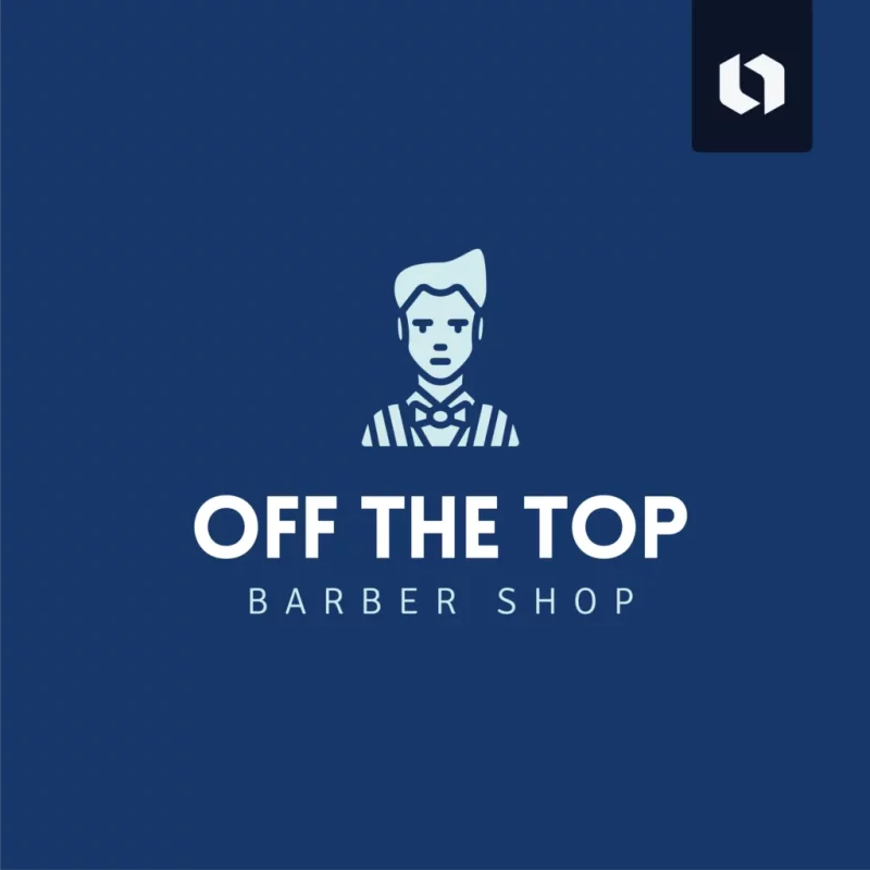
5. Don’t: use slogans without a specific purpose
While the idea of a slogan sounds good, your slogan has to serve a purpose. Maybe your brand name is a bit vague and you want to clarify what you do. This is a solid reason to include a slogan in your logo.
Ideally, a slogan that sticks to the brand and doesn’t need to be changed over the years. For this reason, try not to contextualize it according to any current news or trends. Be honest about how you represent your product or service in your slogan. If not, you will most likely have to change it.

Take Campbell’s soup as an example. In the ’80s, the soup company’s slogan “Soup is good food” was opposed by the FDA because soups contained more than the recommended daily sodium intake. In response to this controversy, Campbell’s changed its slogan to “Mmm! um! Good!” to shift the emphasis away from health, to taste.

In 2017, TD Bank changed its long-standing slogan “Can the Bank Be Comfortable Like This” to “Ready for You”. The move caters to the company’s growing target market, from Baby Boomers to Millennials, who care less about comfortable banking and more about convenience.
The move was also made to create more confidence in the financial future of customers.
Many really successful and recognizable brands like Starbucks, Lululemon and Zara didn’t use logo slogans and their logos still look great! If you don’t have a need or good reason to include a slogan in your logo, we recommend avoiding its use.
6. Choose a timeless slogan
To avoid having to update your logo slogan after a few years, try to use simple language. Don’t use pop culture references, or trending words or phrases, as they will quickly become outdated.
Instead, aim to communicate your brand or product personality or evoke the emotions you want associated with your brand.
Does your brand really need a slogan?
Let’s recap – adding a slogan to your logo adds more information about your company and creates a sense of belonging to your brand. However, logo slogans can also detract from the overall logo design if they are too long or complicated. If you are thinking of adding a slogan to your logo, you should keep the following points in mind:
- Your slogan should point to your key differentiator, whether it’s your brand personality or the product/service you offer.
- The best logo slogan should be short
- Consider placing your slogan somewhere other than your logo for more impact
- Slogans should aim to be timeless
- There is a clear reason to include your slogan in your logo, if not, avoid using it

