Choosing a color for your business logo is a big decision to make. If you’re currently stressed about the decision, don’t worry! Malu Design will help you.
By the end of this post, you’ll know if yellow is right for your logo – and if not, you can at least cross it off your list and move on to the next option.
All in all, your logo color will help send your audience a bunch of subconscious messages so in this post, Malu Design will help you determine if yellow contains the right message for your business. or not.
We will cover the psychology of yellow, what it means when it is combined with other colors and other logo styles, what different industries benefit from yellow logos, etc.
Mục lục bài viết
ToggleMeaning of yellow
Color has a significant effect on our behavior, mood, and even physiological responses. That being said, color associations rely heavily on culture, personal experience, and upbringing — the meaning of color is not a box of crayons that fits.
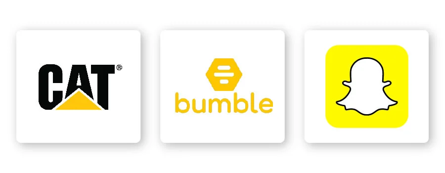
If you want your logo to represent attributes like optimism, fun, adventure, bravery, nature, playfulness, etc., then yellow is the color for you. For example, consider how both Bumble and Snapchat want to get you out there and having fun.

Yellow can also convey innovation and prudence, making it the perfect color for the Cat logo. A globally recognized symbol of outstanding quality and reliability, the yellow triangle symbolizes hard work and an attitude of getting the job done.
As you can see, there are many different ways you can use yellow to help send a specific message to your audience.
How to combine yellow with other logo design elements
When it comes to yellow logos, there are some design elements that combine well and those that don’t.
Typography – Typography
Choosing the right typeface in your logo can strengthen your overall brand. Review the 5 main font families to determine which one best suits your brand.
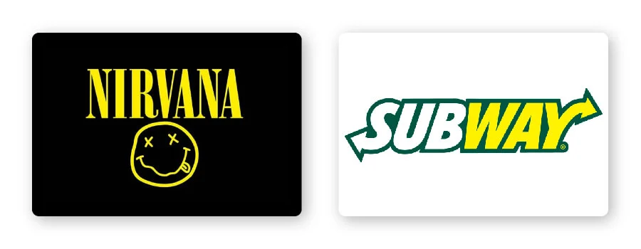
Serif – Great choice for brands that want to be seen as trustworthy, long-standing and trustworthy. Nirvana’s logo is a great example of pairing a serif font with yellow. Yellow evokes energy and warmth, making traditional fonts look eye-catching and memorable.
Sans-serif – Binh Casual, legible and modern, sans-serif is a popular choice among startups, tech businesses and restaurants like Subway. Brands that want to look younger and more relatable will benefit from pairing sans-serif fonts with yellow.
Slab serif – Slab serif font bold and dramatic are often used by technology and automotive companies. Mostly, slab serifs are fun and entertaining, especially when used with yellow.
Script – Great for businesses that want to show off luxury and add a personal touch, such as photographers, coaches or any home brand. Although it’s not very common to use script fonts with yellow, this will be a great combination if you want to express femininity and creativity.
Decorative – This is a loud, fun and entertaining font that pairs perfectly with yellow! These fonts are flexible enough to allow companies to decide which emotions to focus on.
Of course, these are just general rules, but by no means are they fixed. Feel free to experiment with different font combinations .
Shapes and symbols
In your logo design, different shapes can help create an emotional and psychological connection between your brand and the consumer. It’s important to understand what each shape says about your brand and how you can effectively incorporate them into your design.
Triangles combined with yellow can create a feeling of action and activity. The Cat logo embodies these features by placing a yellow triangle symbol in such a way that it cuts across the letters to illustrate the work their machines do.
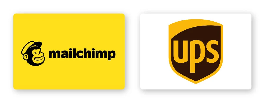
Businesses choose iconic logos to create a classic feel and at the same time appear prestigious and age-old. This type of logo is a great choice for modern businesses that want to convey credibility, dependability, and tradition. For example, UPS chose a symbol to pay homage to their roots and reflect these characteristics through their logo.
In logo design, a symbol is one that conveys instantly recognizable values and ideas. Many brands choose to use animal logos because animal images can reinforce their values and characteristics in the eyes of their audience, such as Mailchimp’s monkey logo. Freddie always winks because he has a great attitude and that positivity is only amplified when paired with yellow.
Is the yellow logo for you?
As I mentioned before, color is subjective and there is no right or wrong way to use yellow in a logo.
With that said, you should use yellow if it aligns with one of your brand messages/values. Or, you can use yellow to set yourself apart from your competitors’ logos.
If your brand is in one of these industries, here are some ideas on how to use yellow:
Yellow logo for construction brand
When you think of yellow in relation to construction brands, you probably think of high-visibility safety helmets. Many construction companies use yellow because it is a bold color and is often associated with construction work, traffic signs and safety equipment.
Yellow logo for dating brand
Yellow creates enthusiasm for life and can evoke feelings of playfulness, confidence, and optimism. These attributes make yellow the perfect color for dating brands like Bumble.
Yellow logo for food brand
Yellow ranks second to red when it comes to food brand logo colors. Think of a few iconic food brands like McDonald’s, Lay’s, and Lipton—each incorporating yellow into their logo designs. That’s no coincidence! Yellow is fresh, sunny and energizing enough to make you hungry.
Yellow logos for technology brands
From dating apps to logo maker apps, technology is a permanent part of our lives that can bring us joy and creativity. If you’re in the tech business, consider using a yellow logo to help your target audience connect your brand with those fun traits.
Yellow logos for entertainment brands
Entertainment businesses aim to make their viewers feel happy, alive and excited. What better color to do it than yellow? For example, the 20th Century Fox Television Company logo has a dominant yellow color that conveys a sense of power, innovation, and creativity.
Yellow logos for logistics brands
Logistics brands need to tell customers that they are fast-paced, hard-working and friendly through their logo. If you take DHL as an example, you’ll see that they can express those core characteristics through their yellow logo.
It’s important to note that there are no matching colors in the box. See what your industry competitors are doing and whether yellow is too commonly used. If it’s overdone, you can think about using an alternate color to stand out. But if it’s not used enough, ask yourself if the psychology of the color is right for your brand before choosing it.
Match the right color with yellow
Yellow can be quite versatile depending on the color you combine it with. Let’s take a look at some examples of yellow logo color combinations:
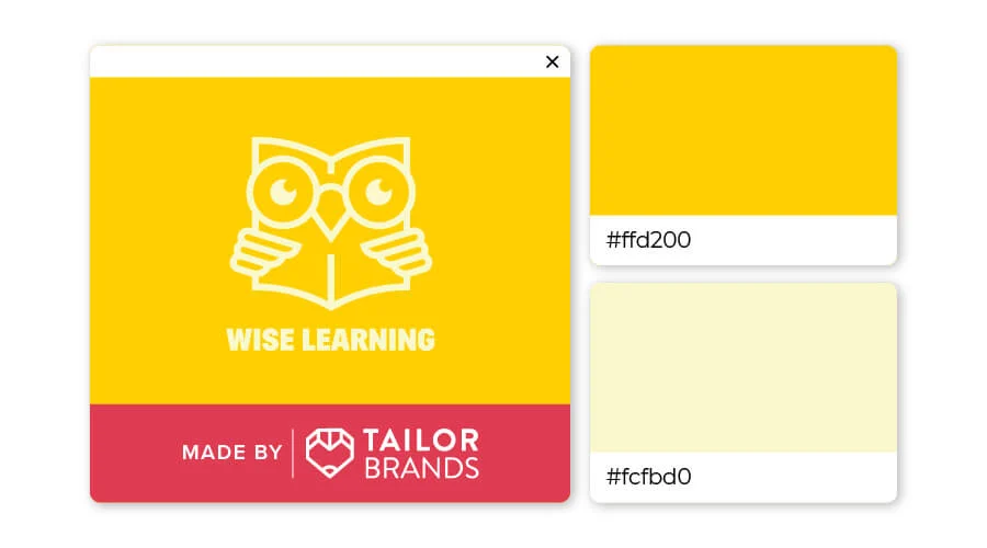
Layering different shades of the same color looks great, and when it’s yellow, it creates a fun yet cozy feeling. Instead of looking one-sided, using a lighter and darker yellow will add depth to the design.
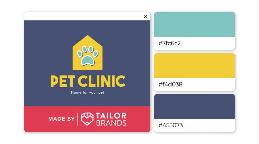
This design takes 2 primary colors and adds their secondary colors to the mix to create the perfect combination! The striking mustard yellow against a navy blue background keeps the logo grounded yet playful, while the green of the sponge gives a natural feel to the overall design.
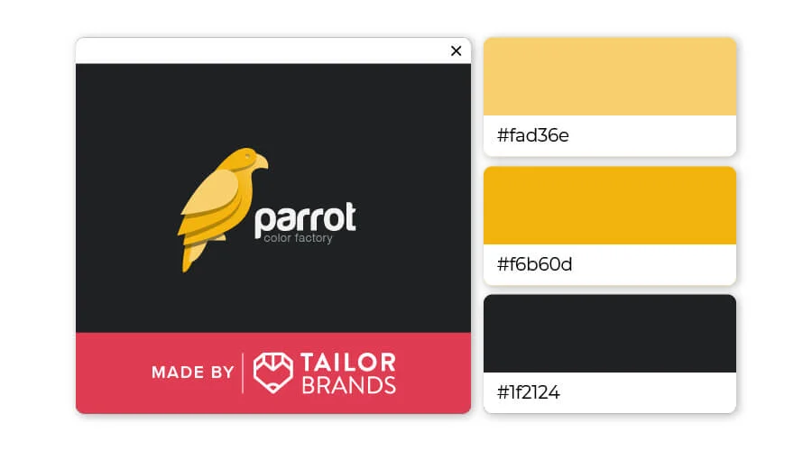
Black and yellow is a classic pairing that evokes feelings of energy, appeal and sophistication. The playful yellow works well with the strong black, creating a logo that helps your logo stand out from the crowd.
Yellow Logo Design Inspiration
Some of the most popular yellow logos actually use only one color to convey their message. Here are some examples of the world’s top yellow logo designs:
McDonalds: The most famous fast food chain in the US mainly relies on yellow as the main color for their one letter logo . Although also using red, the domes that make up the “M” of McDonald’s are completely yellow to convey joy and excitement to customers.
Bumble: Designed as a honeycomb symbol, this dating app has used the color yellow to represent the positive nature of the potential found in this app.
Snapchat: For social media platforms, yellow is not as popular as some other colors. That’s why Snapchat’s yellow color helps it stand out and clearly shows the ghosts about to disappear in the background — just the action happens with the app itself.
Heflo: This is a cloud-based business project management software application. Their designers only needed to add a little warmth to the color to change the look and overarching meaning of yellow in this logo.
Telenet: Focusing on connecting networked computers to devices with remote access, the Telenet logo gives a friendly, ultra-tech look with a friendly and striking yellow color.
The color combination in the logo is popular with yellow
Gold and black
This is a color combination that occurs commonly in nature (like bees and some flowers), yellow and black is the perfect classic blend! Here are some great logos that use yellow and black as their primary colors:
CAT: This is one of the most famous yellow logos out there, this construction company uses yellow triangles to create a real sense of action in their logo. The words arranged in a triangle help illustrate the operation of the machine in an abstract way.
Yellow Pages: Another classic brand – Yellow Pages used the image of gliding fingers to remind viewers of flipping through the phone book. The yellow and white colors in the logo remind us of two colors commonly used to distinguish businesses from individuals.
Mailchimp: A slightly quirky but very distinct design, email brand Mailchimp uses a black monkey border on a gold background to draw attention without detracting from its inherently vintage feel.
Hertz: This car rental brand’s logo uses a simple layout and colors to convey the credibility of their company, namely a combination of yellow and black. Although this brand has been on the market for more than 100 years, their logo has barely changed.
National Geographic: The classic yellow National Geographic logo is hard to confuse with any other — but it looks so simple! The golden rectangle next to the text with a sans serif font created a strong brand impression.
Yellow and red
Yellow and red is one of the interesting color combinations, this is also a style that is being loved by many brands.
Shell Petroleum: Based on a logo designed more than 100 years ago, but its shape and outline have completely changed. Starting in 1948, the company added yellow and red to the design to give it a more energetic and dynamic innovation.
DHL: This logistics company relies on color and horizontal lines in their design to convey their movement and ability to deliver quickly. Red and yellow are used to represent energy and speed in the DHL logo.
Lay’s: Long known for its french fries, Lay’s logo consists of a golden circle representing a potato (or even the sun), covered with a strip of red lettering. These colors represent the excitement, energy and passion of the company.
Kodak: This film company designed a one-letter logo that illustrates a focal point in the distance. These can also be thought of as rays of light entering the red rectangular camera.
Lipton: Lipton’s yellow circular seal is something that we can directly associate with the image of the sun or lemon. This refreshing design focuses on the sweet summer energy that consumers will feel after using their products.
Yellow and blue
Another attractive color choice you can consider is yellow and blue. Although this is one of the less popular combinations, it still leaves a lot of impressions! These colors can be regal or playful depending on how they are used.
IKEA: Renowned as the creative hub for low-cost Swedish home designs, IKEA’s yellow and blue designs stand for perfection in every detail. The IKEA text is contained in a simple yellow bubble that is easy to use in retail spaces and is easy to remember for consumers.
Warner Brothers: Warner Bros.’s yellow and blue colors help to express the brand’s renowned timeless value. They started using these two colors in 1984 to replace the previous color tones of red, black and white.
Juicy Fruit: This fruit-flavored gum uses a combination of yellow, blue and a hint of red to show off the mouth-watering flavor of the product.
Goodyear: With the symbol of the shoe, the messenger of the Greek god (Hermes), the Goodyear tire company is showing that they are one of the fast and reputable shipping units.
Pokemon: This very popular teen and kids game uses yellow words with a blue outline to highlight the brand name. Bright, flashy colors are suitable for children and attract the attention of younger customers (including older users).
Yellow and green
This is the main color tone often used to convey a big idea or health messages, expressing the brand’s conscience as well as ethical values.
Subway: These bright colors are said to represent health and positivity. The combination of color and sunshine represents a delicious snack that sets Subway apart from other brands.
Sprite: As a soft drink that is said to have more natural ingredients than many other soft drinks on the shelf, the Sprite logo feels bright and energetic.
John Deere: This hugely popular farm machinery brand uses the yellow of the harvest season and the green of the summer to show its connection to agriculture. The image of a dancing deer also creates the illusion of movement. While the deer symbol has been in the logo since 1976, the green and yellow palette was added in 2000.
BP: The British Petroleum logo with a combination of green and yellow was introduced in 1947. By 2000, it had dropped the shield and changed to a flower symbol. Although BP is known for various environmental issues, they still choose green and yellow as the main color to express their priorities on energy, nature, growth and goodwill.
The Grounds Guys: This is a prime example of how color makes a big difference in logo meaning. While some of the previous examples show bright color combinations, the green and yellow of The Grounds Guys logo is much more authentic and natural. This gives the logo a more believable look with a steady source of energy.
Yellow and brown
Yellow and brown are less common, but that doesn’t mean it’s unpopular. Brown is not common in logo designs because it creates a dull and monotonous feel. However, when combined with yellow, brown can really create a great effect.
UPS: The shield shape representing reliability and integrity has remained the same since UPS’s inception in 1916. Last 2 logos (introduced in 2003 and later in 2014) all use the same shield shape with the same layout and font. The biggest difference is the change from a shiny 3-D bronze gold design to a flat design with vibrant gold and dark brown. The colors of the UPS logo are the same as the cardboard packaging and colors of the brown trucks the company uses.
Reese’s: A combination of orange, yellow and brown to symbolize the milk chocolate and peanut butter cookies/candy. While the colors don’t exactly match the actual color of the product, they do provide a vivid visual logo that excites customers.
Hard Rock Café: Did you know that the original colors of Hard Rock Café were red, white and blue? The founders wanted to create a cafe with American charm combined with a bit of rock n’ roll style. However, famed graphic designer Alan Aldridge didn’t feel the right fit, so he switched to sepia and mustard yellow – now iconic for the brand.
Gevalia Kaffe: This brand is aiming to be a high quality coffee brand. The Gevalia logo has a crown and a golden color that shows luxury. Brown represents the color of coffee beans that are roasted and ready to be brewed.
Valparaiso University : Brown represents the intellectual foundation, white represents power and yellow represents the fire of energy in the Valparaiso logo. According to the Valpo website on branding guidelines, “The main colors of Valparaiso University are brown, yellow and white. A complete color palette, including primary colors, background colors and neutrals. Color has one of the closest relationships to memory, and consistent application of primary colors and complementary palettes is important.”
For you
We have seen that yellow represents creativity, playfulness and courage, among other things, but combining it with other design elements can create a unique and impressive logo.
You can use Malu Design logo design service to reduce your risk and save your time. Get started now!
If you are looking for a reputable and experienced unit to be able to design a professional and impressive logo and brand identity system , then please contact us immediately by phone. 0988 622 991, or leave your information and requirements, Malu Design ‘s consulting department will contact you right away to answer all your questions!
————————
Malu Design – Branding Identity Agency
Hotline: 0988 622 991

